With more and more people consuming their music digitally these days, Album cover arts aren’t as important anymore, which makes the masterpieces of the past a lot more valuable.
And they deserve to be enshrined, on more than just plastic CD covers or Vinyl cases. For those who get bored of looking at their worn out kicks, getting someone talented to illustrate your favorite album cover on them is beneficial, especially when you spend most of your life avoiding eye contact with people on the subway.
Pink Floyd – Dark Side of the Moon
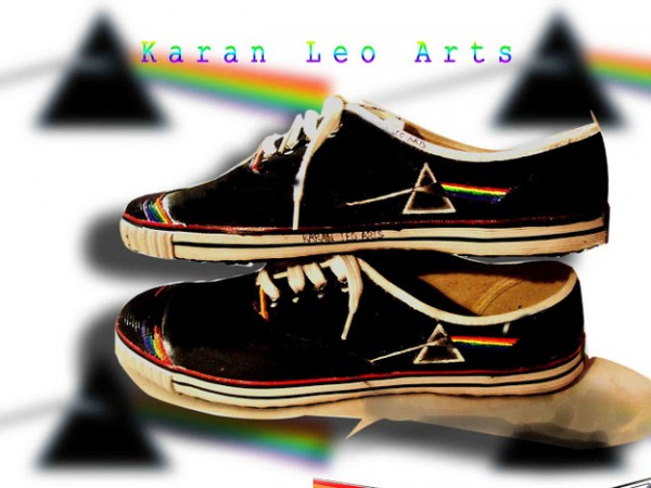
The prism design was inspired by a photograph that Storm Thorgerson had seen during a brainstorming session with Aubrey Powell. The design represents three elements; the band’s stage lighting, the album lyrics, and Richard Wright’s request for a “simple and bold” design.
Jimi Hendrix – Electric Ladyland

Hendrix wanted something very different for the cover, but he was ignored by the record label. He asked for a color photo by Linda Eastman of the group sitting with children on a sculpture from Alice in Wonderland in Central Park, but got a blurred photo of his head instead.
Metallica – Kill ’em All
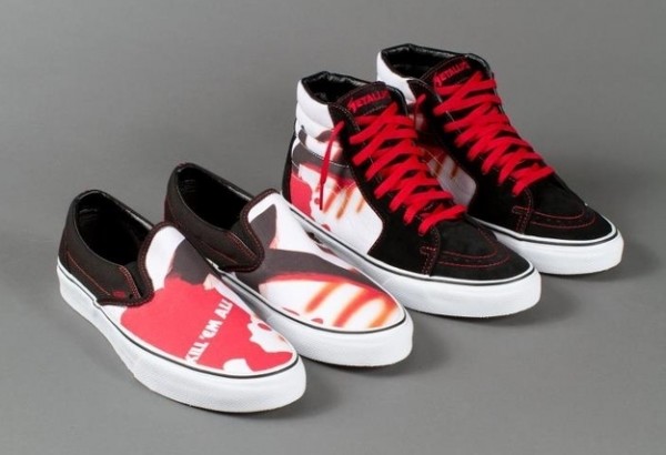
The band initially intended to title the album Metal Up Your Ass with the cover featuring a toilet bowl with a hand clutching a dagger emerging from it.
Red Hot Chili Peppers – Stadium Arcadium
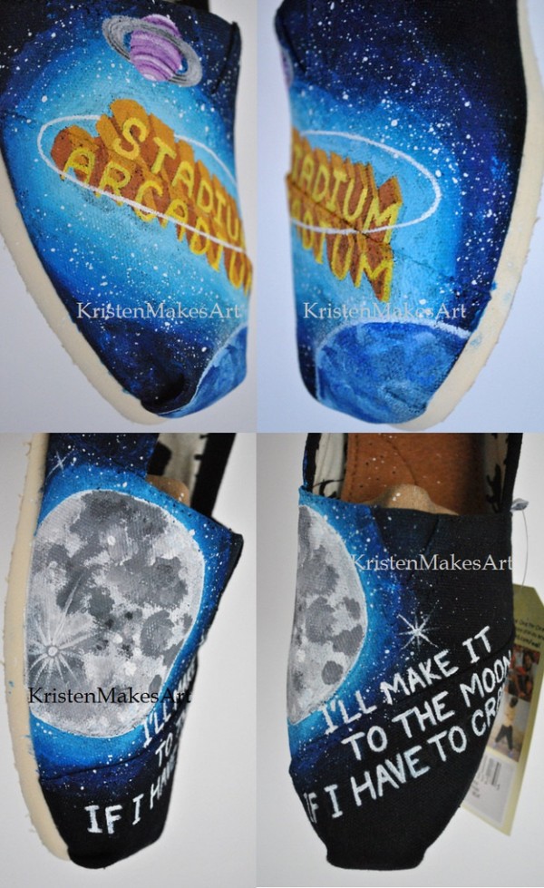
Thorgerson (him again) provided at least three possible covers for the album, however, his ideas were ultimately rejected and a simple cover featuring yellow “Superman” lettering and a blue background with planets was utilized instead. Thorgerson publicly denounced the chosen artwork, stating: “For the Stadium Arcadium cover they elected to feature the title in ‘superman’ lettering which was already old fashioned in itself, plus some “planetary embroidery” and that was it! It was trite, dull and derivative completely unlike the music, which was colorful eclectic, imaginative, positive, and endlessly inventive. I am not often inclined to publicly criticize the work of others for I see little purchase in it, but there is, in this instance a vested interest, for the Peppers turned down our offerings in favour of this piece of unadventurous graphics. How could they?”
Fall Out Boy – From Under the Cork Tree
The album cover features a van with a trailer in a slump of snow. This is a reference to the car accident the band was in while they were driving to New York to film the video for “Grand Theft Autumn/Where Is Your Boy” from their album Take This to Your Grave.
Iron Maiden – The Number of the Beast
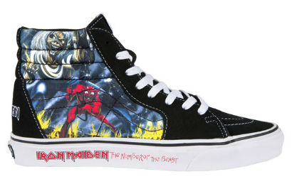
The cover was originally created for the song “Purgatory”, but Rod Smallwood deemed it of too high a caliber for a single release and decided to save it for The Number of the Beast album instead. The original 1982 artwork includes a light blue sky in the background; this was a mistake by the printers of the album cover, and was later rectified and became black when the album was remastered for compact disc in 1998.
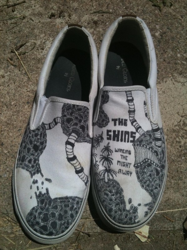
The Shins – Wincing the Night Away
Neutral Milk Hotel – In the Airplane Over the Sea
A collaboration between Mangum (the band’s leader) and R.E.M.‘s staff designer, Chris Bilheimer. The general design reflects the taste of Mangum: Bryan Poole said that “Mangum was always into that old-timey, magic, semi-circus, turn-of-the-century, penny arcade kind of imagery.”
The band managed to release only two albums before the lead singer, Jeff Mangum, broke the group up after suffering from a nervous breakdown and the pressures of touring.
Sleeping With Sirens – With Ears to See and Eyes to Hear
For more musical art that is just to awesome not to share, check out 15 Alternative Fan Art Works of Great Rock Bands.
(Via: Aaron Calvin)


