What happens when a website which stood third in the top 100 searches of 2009, just behind YouTube and Google and another which also happened to be the most used word in 2009 are compared? For those who aren’t on the same page, well, we’re talking about Facebook and Twitter here. This Infographic by Digital Surgeons compares the two epic websites brilliantly!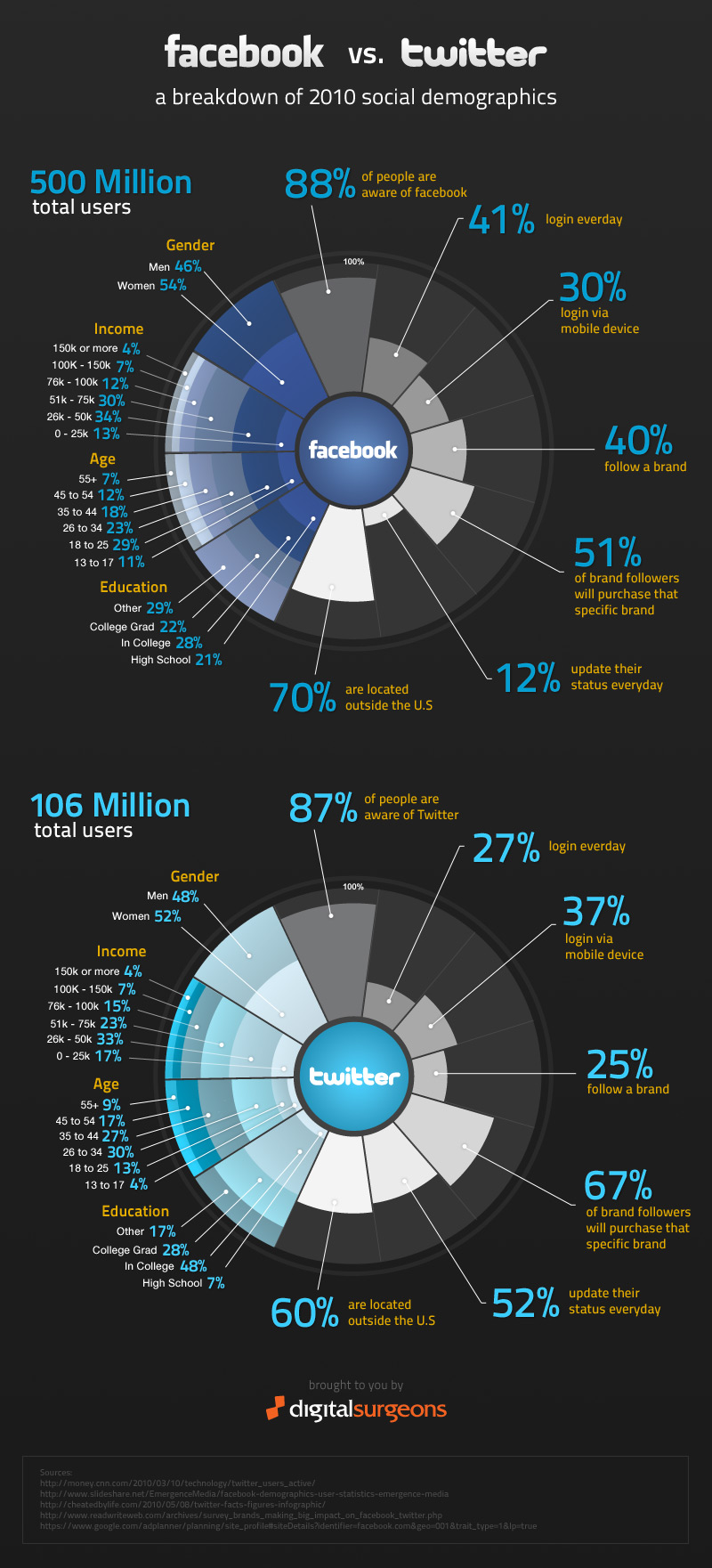
For starters, out of the total living population, around 88% are seemingly aware of Facebook as compared to the 87% that are aware of Twitter. Furthermore out of the so called socially aware people; Facebook has 500 million users which is way above the 106 million users of Twitter and while 41% of the Facebook users log into their accounts on a daily basis, only 27% of the Twitter users do so.
This Infographic has also cleverly divided the Facebook and Twitter users based on their Gender, Income, Age and Education. It is noted that while the number of female users beat their male counterparts on both Facebook and Twitter; when it comes to income it seems the richer you get the less time you have for both the social networking sites, with users with an income of 150K on both occupying a mere 4% of the total.
Talking about advertising on these two sites, it is noted that while 40% of the users follow brands on Facebook, only about 25% do so on Twitter but brand followers on Twitter are more likely to purchase products of that specific brand than a Facebook brand follower.
If you’re a social networker yourself, you’ll be happy to check out the Adidas Facebook and Twitter Superstars and the Twitter Towel.
Via: TheNextWeb


