The psychology behind web design is fascinating yet some people miss the mark. Focusing on structure, goals and purpose will make your site more appealing.
Structure
As people in a growing world of information that doubles in size at amazing speeds, our daily consumption of data should not be impeded by bad design. To speed up the process of analyzing data, focus on structure.
You’ve heard of semantic structure where content and code are structured in a way that a machine such as Google’s search bot can understand but what about the design of a web page? A good web page should be instantly recognizable and highly legible by a visitor to not waste time. Creating a very clear structure in your design that tells the visitor what the site is and does will speed up their decision on whether or not to stay.
A website’s structure shouldn’t be overcomplicated or hindered by the graphic elements of the page. A simple minimalist layout is typically the default design choice and while not inherently bad, it’s not always the right solution. Choosing a minimalistic layout is enticing as structure is very easy to create and not burdened with looking good rather it worries about being functional. Minimalism works best when it’s needed and used in moderation. A Blog that focuses 100% on writing doesn’t need superfluous elements and a minimal layout will work. An elaborate news site still needs the same structure so that new and current visitors know what to expect yet are enticed about what’s beyond the posts such as videos and galleries.
Goals
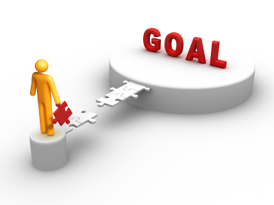
People like others who are goal oriented and love a website that demonstrates the same quality. If a user needs to do something on your site beyond reading and scanning, they need to fell like they accomplished something along the way.
A mistake many sites make is bombarding users with tasks to achieve a goal. Whether it’s an ecommerce site or web app wanting you to register, the process should as stripped down as possible. While there is some data that is absolutely crucial to the process, visible goals and achievements aid the user. By showing a visible status bar, steps remaining or the positive action of them completing a task you’ll start to involve them more. Users are more likely to leave when filling forms, especially nonessential ones.
If a process is going to be long and arduous, explain that to the visitor but reassure them that each step brings them closer to their goal.
Purpose

Users need to feel there is a purpose for them coming to your site and accomplishing the actions you want them to do. Designing a site that visualizes this will make users more willing to explore.
A site’s purpose should be very clearly defined from the first second a new visitor comes to the site. Think about the aim of your site, if you think looking pretty is the first priority and that function follows form, you better rethink why you have a website. For example, a blog is meant to be read and promoted so larger post titles and short descriptions should stand out from the rest of the content. If you’re selling a product online, the user should know the site intends to sell something instead of display information about it.
While text and design can reinforce the message of purpose, every element needs to work together on explaining the site’s purpose to a visitor. However, you shouldn’t completely ignore design and color as they can be very powerful when used correctly. An e-comerce site may opt for blue colors during the checkout process to give visitors a sense of security. On the other hand, an environmental Blog may use a minimalist layout and green color to give the visual impression the environment is the focus.


