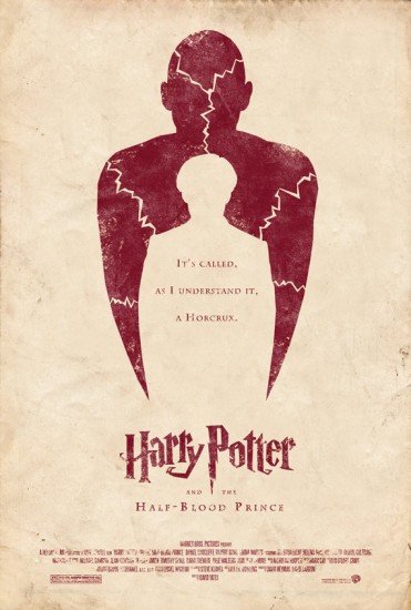
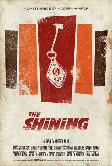
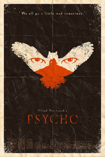
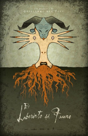
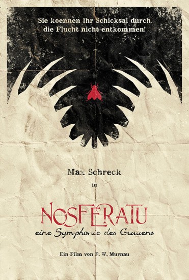
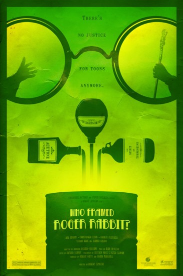
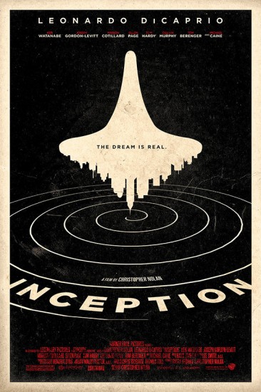
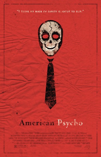
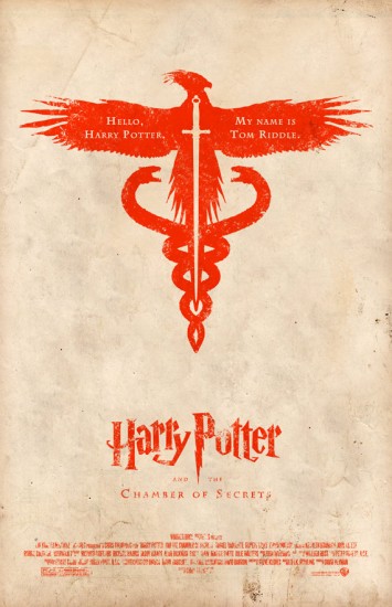
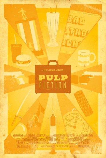
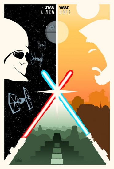
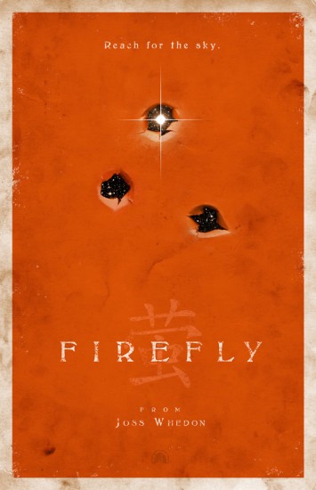
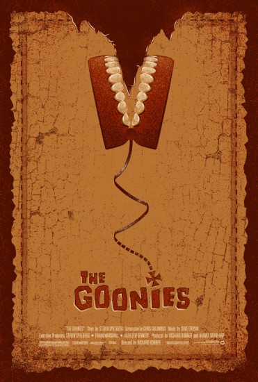
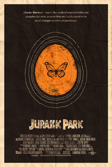
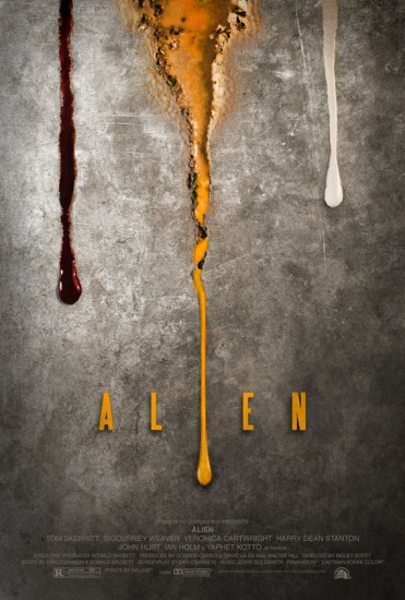
Movie posters should incite intrigue and a growing desire to see the film and understand what the poster is about. A new collection of posters from popular movies takes a new spin on a “movie description.”Movie posters are supposed to make us think, supposed to spark a desire to see the film and enjoy (hopefully with a large drink and a jumbo popcorn). However, movie posters today are…well, dull. I am not saying they do not look bad, but they are dull. They are often filled with the faces of the stars of the film doing some kind of action that is film-related. Or you have the dreaded “floating head” on a background that somehow is connected to the film. Does it up my desire to see a film? Not so much. I just use them as a point of reference regarding what movies are in the theater and who is staring in them (and possibly deface them if i think at all necessary).
I would love to see movie posters that illicit some kind of meaning, posters that show the real theme of the movie and get you thinking, “Hey, I want to know what this picture means, I think I will go see the movie.”
This is exactly what artist Adam Rabalais has done – taken popular movies and redid the poster to show the actual theme of the movie, the idea of the movie, what the movie is all about. Check out some of his gallery below.
For more of his work, click this link!
Do you like movie posters? I do. If you want more great movie poster art, be sure to have a gander at movie quotes turned into superhero posters and interesting alternative posters for The Dark Knight Rises.

