Since the launch of Star Wars Episode VII: The Force Awakens is less than a month away, Google figured out that it’s about time people chose whether they want to fight for the Light or the Dark Side.
Found at google.com/starwars, the site in question offers its visitors a simple choice, but with life-altering consequences. Basically, what the tech giant would very much like to know is which side of the Force you’d rather be fighting (or just rooting) for: the Light Side or the Dark Side. The consequence is presented in the form of a skin for 11 of Google’s service, so choose wisely, young Padawan (or Sith Acolyte, I don’t judge)!
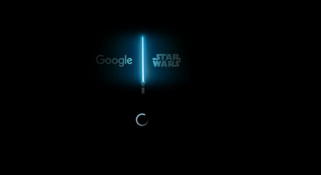
The first thing you’ll see after shooting up the website is a loading circle along with the Google and Star Wars brands positioned on each side of a lightsaber. Clever? Very much so, I’d say, since every element of the website needed to be themed, and they couldn’t have left a boring loading page in place, now could they?
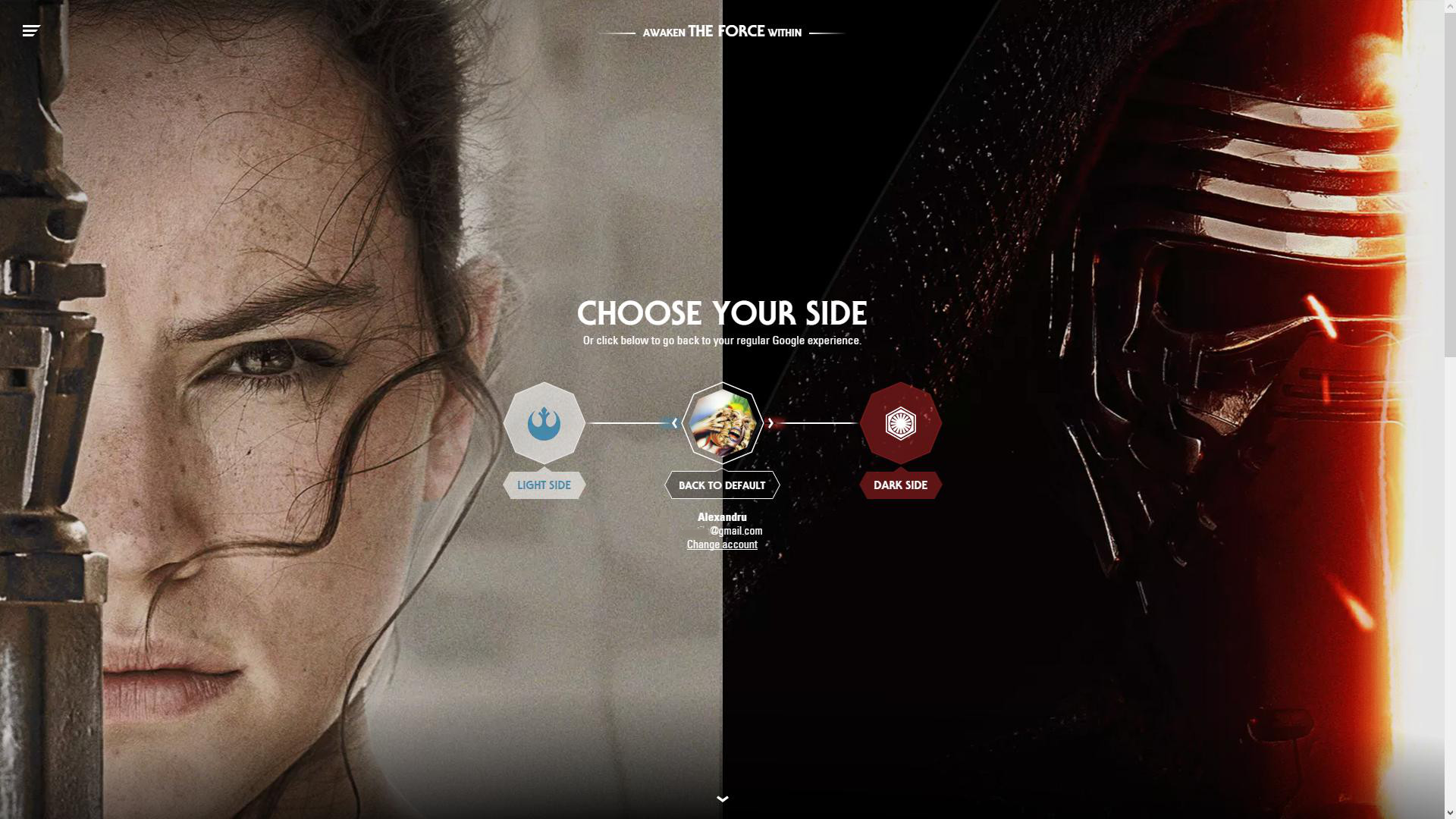
Assuming that you’re already logged into your Google account in the browser that you’re using, a page will appear next, asking you to choose your side. On the left, there’s Rey representing the Light Side, while on the right there’s Kylo Ren on a dark background, holding his lightsaber in hand.
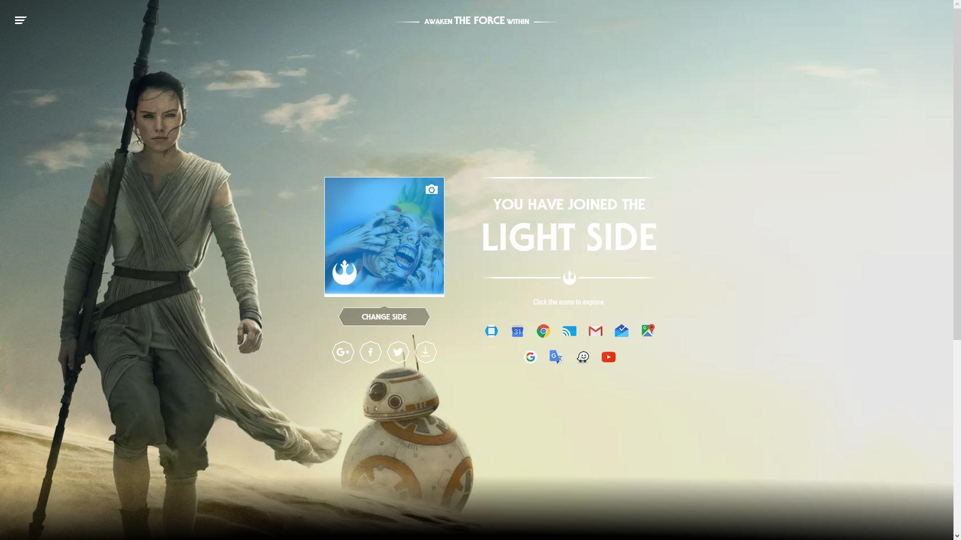
If you happen to choose the Light Side, the whole background will change to a picture of Rey and BB-8 in the dessert. Your avatar will get a filter (blue if you join the Light Side), and you will be announced that you’ve joined the side you picked on the previous page. A small Alliance Starbird is displayed, along with the 11 (now themed) services that you can visit.
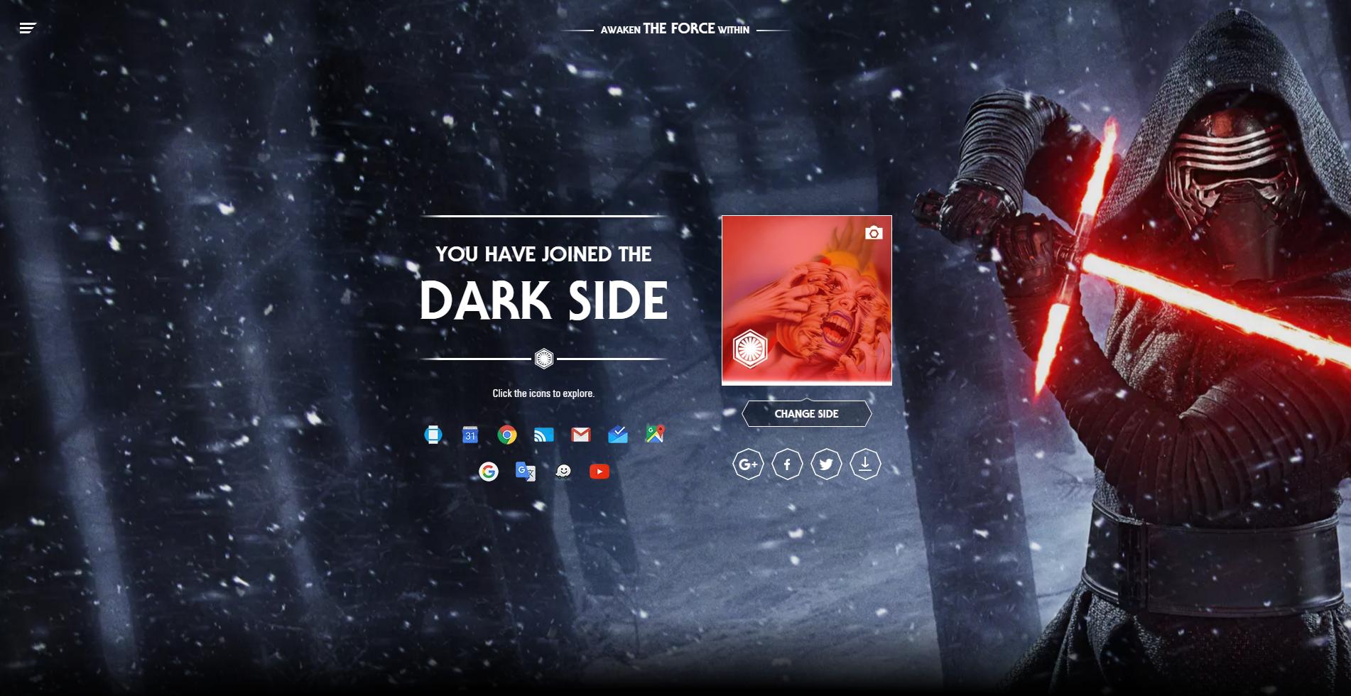
Personally, I would recommend you to join the Dark Side, not only because the background image is much cooler, but also because they have cookies. Or so they said. As you can see in the above image, Kylo Ren is displayed with his Swiss knife-like lightsaber in a fighting position, and other than that, and the Empire’s logo, there aren’t any differences from the Light Side’s page.

Most of the differences are visible on Google’s services after picking a side. For example, Gmail’s loading bar is now a lightsaber that fills with red for the Dark Side, respectively with blue for the Light Side. The same goes for the progress and volume bars on YouTube. In Google Maps, you’re location is now shown using a TIE fighter or an X-wing.
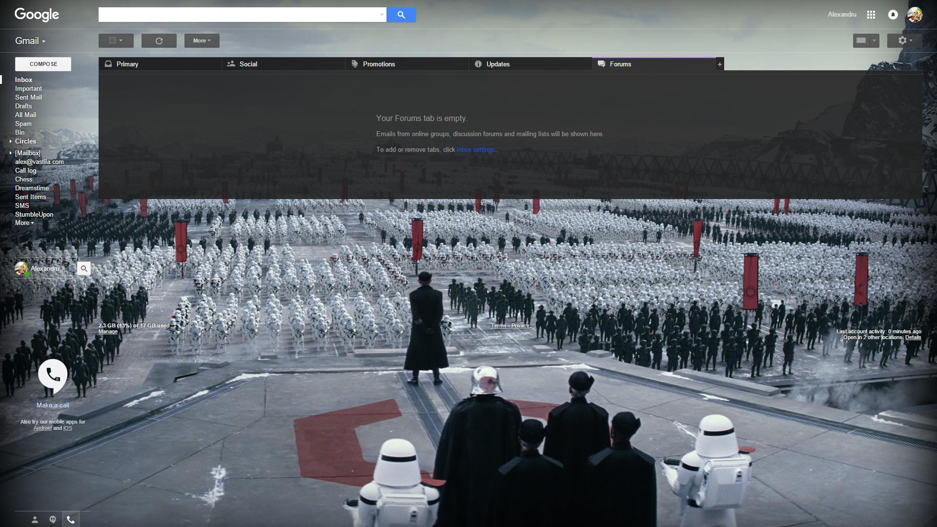
The background of the services also changes, to reflect that you’ve shown your allegiance to a particular Side. You can tell which Side I prefer, and according to the website, I’m not the only one, as most people seem to go with Kylo Ren. Star Wars definitely has a lot of fans, and as VP of Product Management Clay Bavor pointed out, the Google galaxy is full of them: “You can regularly spot Darth Vaders, dogs dressed like Yoda, and even the occasional stormtrooper, roaming the halls of our data centers (probably still looking for those droids).”
Be social! Follow Walyou on Facebook and Twitter, and read more related stories about the HP Star Wars Special Edition notebooks, or the Sphero BB-8 app-enabled drone.


