The Internet is big. Really big. You won’t believe how vastly, hugely, mind-bogglingly big it is. One guy has, however. He’s made a map of it.
Russian programmer Ruslan Ekineev has created The Internet Map. Like the name suggests, it’s an attempt to create a map of the Internet. Just punch in a domain name in the search box and you’ll see all the sites that link to page represented as planets. They’re also color-coded by country name. Just being confronted with the default state is just enough to make you realize how big the Internet is.
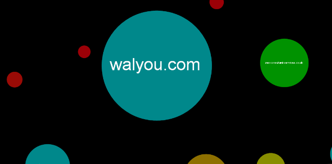
“Like any other map,” he explains, “The Internet map is a scheme displaying objects’ relative position; but unlike real maps (e.g. the map of the Earth) or virtual maps (e.g. the map of Mordor), the objects shown on it are not aligned on a surface. Mathematically speaking, The Internet map is a bi-dimensional presentation of links between websites on the Internet. Every site is a circle on the map, and its size is determined by website traffic, the larger the amount of traffic, the bigger the circle. Users’ switching between websites forms links, and the stronger the link, the closer the websites tend to arrange themselves to each other.”
If you want to get out of the house and do some grilling, check out an infographic on barbecuing in America. You might also be interested in The Internet of Things.


")


