Even non-Industrial Design followers like myself will find the name Bang & Olufsen familiar. I’m not exactly sure where it’s from, but they’ve somehow permeated my mind. I’m both impressed and a bit distressed at that.
Bang & Olufsen are creators of audio systems, televisions, loudspeakers, telephones, and other sorts of digital media products. Here are some examples of the art direction they could be implementing in their ads:
The designs feature a font called Frutiger, which I’m new to. I’m aware that Futura and Helvetica, which Frutiger reminds me of, are standard fonts a lot of the time, especially used in posters, larger designs, and the such. Frutiger’s a pretty decent looking sans serif font and I like how designer Muggie Ramadani incorporated a relatively unknown font into the design.
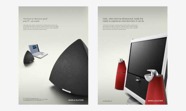
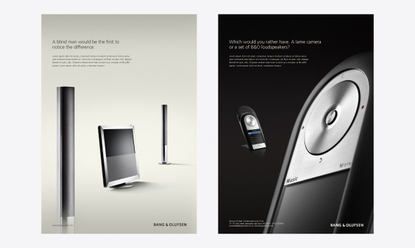
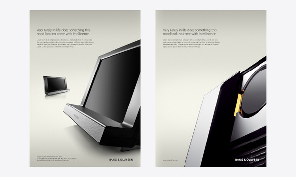
The advertisements all are based along one main pattern. They feature either a black blackground, or a white gradient background. The Bang & Olufsen name is imprinted in the the bottom right hand corner of the poster. In the top left corner, there is a catchy little sentence, such as “For an unlimited time, Bang & Olufsen will be handing out free samples of adrenaline when you visit our showrooms.” Underneath that is some text presumably detailing the product.
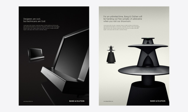
The highlight of the design would be the B&O product, which itself is very well-designed. These B&O products all feature very sleek designs highlighted by the unique lighting and shading schemes used in the photograph. Also, there are two images of the product; one sized up, which is the main focus, and the second one in the background, which serves as what I’d consider to be more of a overview of the general product. These setup is similar to other high-end audio ads that can be found in all sorts of technology publications these days. I’m not sure if B&O was the one who started this type of patterning, or is merely continuing the trend. Either way, I like.
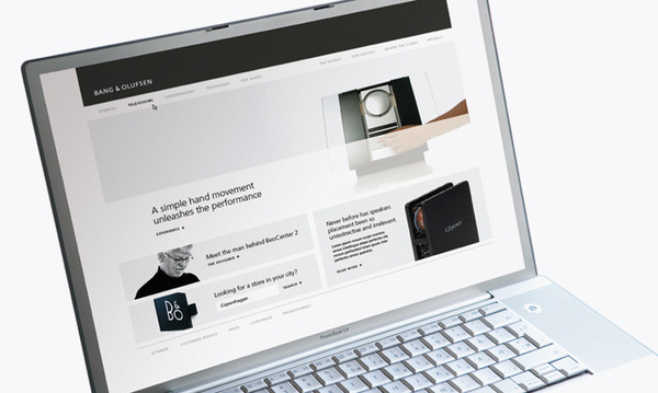
Not only did Ramadani create a new set of ads for B&O, but he also created an alternate site design. The current B&O site has a darker color scheme, and a sidebar that includes most of the navigation, whereas this one relocates navigation to the top. I’m a fan of the current dark scheme that B&O has, but I can also see them going with a more light design. I would like to see more color somewhere though, preferably in the graphics and not in the design itself.
This concept work is pretty awesome, and if Ramadani didn’t have a job with B&O before he’ll probably get one now. 😛 If you like designs, have a look at the Serenata Phone also by B&O and Samsung, or the Samsung Printer concept.
Via: Behance


