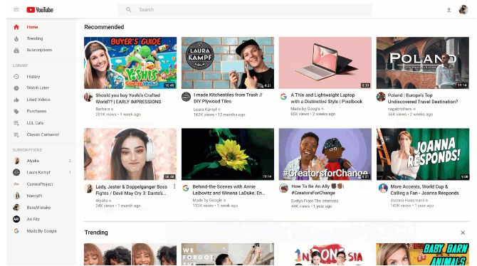
YouTube has just announced a brand new look and design for its desktop and tablet applications. The new YouTube homepage redesign comes with a fresh new look that is easy on the eyes and smart at presenting content. The reason why YouTube has launched the new design is to make finding videos people want to watch easier. This means, it goes far deeper than a mere design update. YouTube’s new redesign comes with deeper algorithmic changes to present you with the videos that are most relevant to you.
YouTube homepage redesign comes with many improvements
Here are the specific changes that are coming to your YouTube homepage:
- Video titles are longer, so that viewers can easily grasp what the video is all about
- Rich thumbnails to help users grasp visually the essence of the video
- Video previews now have higher resolutions and look attractive and pleasing to the eyes
- A cleaner design that removes some content shelves that were not quite necessary
- On the homepage, viewers can easily recognize the creators of the video thanks to channel icons
YouTube redesign takes customization to the next level
Other than these changes that have been made to the homepage, YouTube has taken the redesign to the next level. It offers deeper customization so that you can queue what you want to watch next. The “add to queue” feature is eerily similar to iTunes, but we all know that most tech companies feel “inspired” by each other. Your currently playing video will not be interfered with even as you add other videos to the queue. You might want to keep in mind that once you close the browser, the videos in the queue won’t be saved. You will still need to add them to your “Watch Later” playlist if you want to access them much later.
If you don’t want to watch content from certain channels, you can remove those suggestions. There are times when we got to see content that we didn’t want to see, based on our viewing history. Now, you can simply mark them under “Don’t recommend channel”.
What are the future plans?
YouTube has many more plans for future updates. In its blogpost, the company revealed what will appear in the near future. A feature that was available only on YouTube’s Android app will come to desktop and tablets soon. You will be able to select your favorite topics so that your Home feed feels more customized. In addition, further changes to the size of thumbnails and design of the pages are sure to come by in the next few weeks.
Many of these changes may seem inconsequential to you, but they are quite important. When content is easier to view and videos that we like can be accessed easily, the experience of viewing YouTube will be much richer. In addition, YouTube needs to offer changes so that advertisers and content creators get the views they need as well. Thus, the redesigns are not meant for just the consumers of content, but the wishes of content creators and advertisers have been taken into account as well.
When Google and other companies have to fight for viewership
Google has been trying to improve YouTube viewership from a long time. We had written about how it made using YouTube Music compulsory on Android devices. Google had also launched YouTube Gaming back in 2015 to fight its competitors. However, YouTube has its share of competitors too. For instance, Spotify tried to take on YouTube and began working on a video sharing service in 2015. Nevertheless, YouTube has remained the king of video content for a long time now.


