Facebook have once again altered their news feed and putting emphasis on media and advertisements, it’s set to be their most controversial redesign yet.
![]()
In a new move that will likely appease just a small amount of users and anger an awful lot of them, Facebook have revealed a newly redesigned news feed. Set to be rolled out to all users over the next few weeks (with the option of signing up to an early release waiting list also available), Facebook CEO and creator, Mark Zuckerburg, announced the new interface yesterday at a press conference in San Francisco, California.
The biggest talking points are that Facebook designers have put music, games and advertisements at the forefront of users’ interfaces in an effort to “reduce clutter” and create a “personalised newsfeed”, hopefully meaning more media and more of your friends and family’s breaking news about their drama, questionable lifestyle choices and what they had for lunch will remain unadulterated by things that you just don’t want to read. Provided, of course, that you don’t mind your newsfeeds tainted by ads.
While some will no doubt say that these new changes to Facebook’s look are a breath of fresh air for users, many of whom weren’t satisfied with Facebook’s redesign the last time round, a bit of insight will tell you that the change reflects a focus around one thing : money. Shares for the site have dropped off a cliff of monetary losses and this new design is hoping to turn Facebook’s profits around, with economic experts suggesting that this could be the thing that does it.
The guardian newspaper spoke to Ian Maude from Enders Analysis who said of the change that “the trick is going to be managing the volume of ads people see in the news feed and getting the balance right between maximising revenue but also keeping users happy”. But how that will pan out as Facebook attempt to best the $4.27 billion in ad revenue from 2012 has yet to be seen.
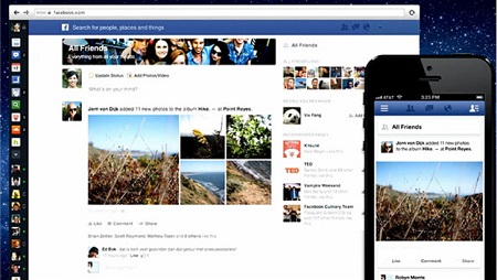
Of course not everything in the change reflects a mad dash to increase profits, Facebook’s new look is genuinely a lot cleaner. As you can see in the picture of the redesign above (alongside how the redesign will look on mobile devices), all of the buttons and links to the things that are most important to Facebook’s 1 billion users are in plain view, allowing for ease of access. Facebook’s new look also seems to be more fitting for photos and videos, of which makes up 50% of all content on the site.
Stay tuned to walyou (and your Facebook newsfeeds) to see what the redesigned interface brings.
Source : guardian
Read more on walyou, Understanding Facebook Through Infographics and 17 Fun Facebook Products and Designs


