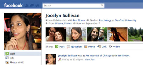
Facebook has designed a new look for users’ Facebook profiles, a change that is especially significant given how central the profile page is to the Facebook experience. Although not the first time Facebook has reconstructed the profile page, the new design is especially attractive and engaging.
As Facebook explained in a blog post, the new design aims to make it easier to quickly glean key information about a person from their profile and tries to “[make] your entire profile a more compelling visual experience” by featuring photos and images more heavily than before.
Personal information, such as your job, school, location, and hometown, and birthdate, along with recently tagged photos will now appear at the top of your profile.
“The profile begins with a quick overview of basic information such as where you’re from, where you went to school, and where you work–?the kinds of conversation starters you share with people you’ve just met or exchange with old friends as you get reacquainted,” Facebook explained.
Additional changes include revamped photos and Friends pages, as well as the ability to feature certain groups friends (or “highlight meaningful relationships”) on the profile page. Rearrangeable icons, rather than text, will now be used to represent interests and experiences.
While the emphasis on photos is arguably a positive or negative new characteristic of the update, the new layout is reminiscent of the 1st and 2nd generations of the profile page. The increased access to information and return to vertical lists (as opposed to horizontal menus) is a welcomed return, and the added profile info is also a nice addition.
Facebook is beginning to roll out the new look and all users should receive the upgrade by early 2011. (Alternately, you can upgrade here).
Looking for more Social Networking news? You’ll love Facebook E-mail, Facebook Introduces Messages and Rockmelt Browser Unites Social Networking with Search.


