Google Hong Kong gave away an eyeful of the upcoming version of Android (Gingerbread 2.3) this week, and from what we can take away in the released video, it looks like a sweet update.

The minute-long clip that was intended to just show the Voice Search feature on a Nexus One provided a nice sneak peak of some of the changed details and nuances of the Android OS. For the most part, it looks almost exactly the same as its predecessor (2.2 Froyo), but the Google team made some much-needed aesthetic changes to the interface.
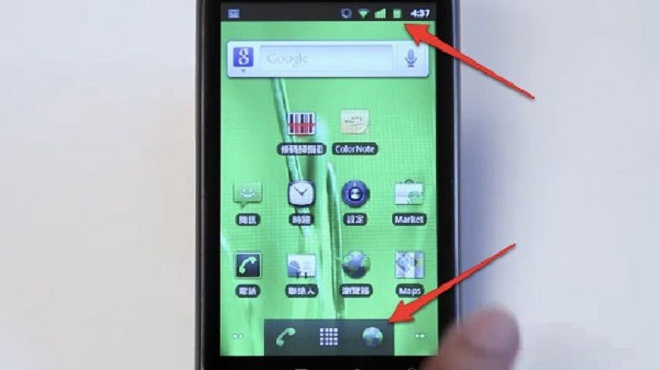
Overall, the look is somewhat darker than the current grey/silver color scheme. The notification icons are also changed (as previously rumored), taking on a more stylish, less flat design. Furthermore, checkboxes and buttons throughout Android also get a bit of darker colored paint. The video also gives us a glimpse of the new expanded Android Market (A third tab has appeared on an app’s page that lets users find related apps in the store.)
There are still several features that are expected to roll out of Gingerbread that were not in the video, such as video chat or WebM video. However, it’s becoming clear that Google’s intent when it changed Gingerbread’s update code from 3.0 to 2.3 was to force consumers to understand that Gingerbread is not supposed to be a major update or overhaul of Android OS.

What Google did change about Android is still much appreciated, such as the more modern design elements. The notification bar now kind of fades away and out of immediate view unlike the brighter silver-toned version pre-Gingerbread. The darker buttons seem to have a classier, more refined look and feel compared to the obtrusive silver scheme found in Froyo. Case in point, Gingerbread looks like a much-needed and welcome update, but Android’s biggest modifications are still to come.
Looking for more Android news? You’ll love The LG Star, Motorola DEFY and Droid 2 Global.
Via: electronista, gadgetsteria


