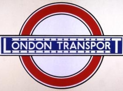
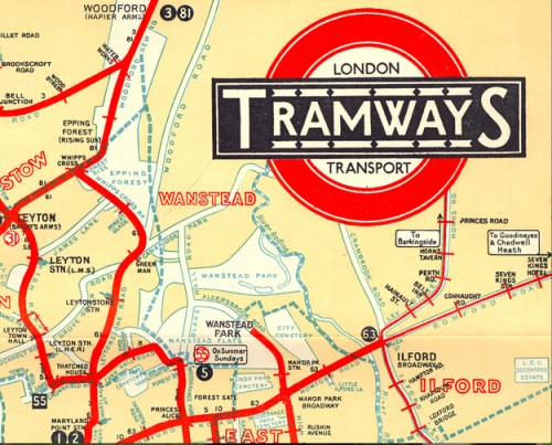
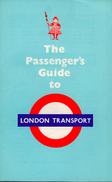
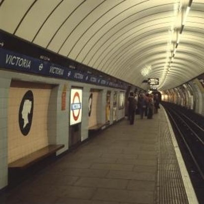
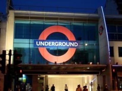
The London Underground, also known as the Tube or the Underground the world’s first underground railway,has obviously undergone quite a few changes over the years since opening 150 years ago, and the same can be said about it’s logo, which is probably it’s most famous aspect.
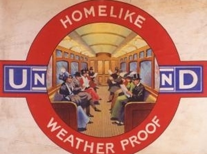
1908/1909
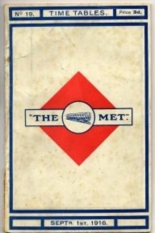
1913
The Metropolitan Railway which opened in 1863 and now forms part of the Circle, Hammersmith & City and Metropolitan lines, and also the first line to operate underground electric traction trains, the City & South London Railway in 1890, now part of the Northern line.
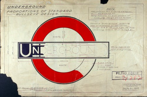
1923/1925
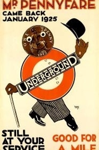
1925
The schematic Tube map, designed by Harry Beck in 1931, was voted a national design icon in 2006 and now includes other lines – the Docklands Light Railway and London Overground – as well as the non-rail Emirates Air Line. London Underground is celebrating 150 years of operations in 2013, with various events to mark the milestone.
1933: Bus stop flag
1933
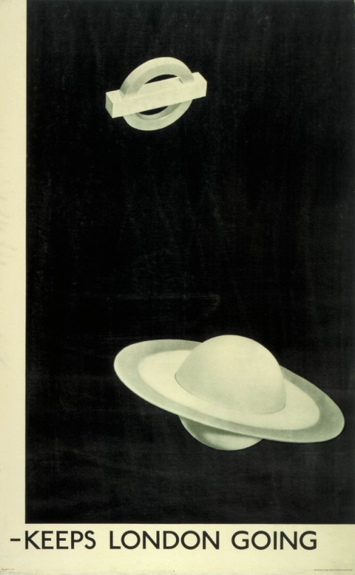
1938: “Keeps London Going”
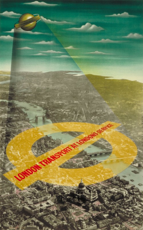
1947: “London Transport At London’s Service”
1950: Post-war leaflet about London Transport
1970
2002
For some more on logo changing, or in this case packaging changes, take a look at 100 Years of Oreo Packaging.

