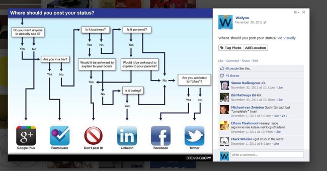
Facebook has made some tweaks to its photo viewer and is rolling them out quietly.
Previously, when you clicked on a picture in Facebook, it would show up bigger in a lightbox, with the comments under it. If you wanted a like a photo or comment on it, you had to click in order to get rid of the photo and do your thing.
This new photo viewer puts the comments and likes to the right side of the photo. You can like and comment a picture without breaking up your flow on the site. You can view a a full-size photo and watch the comments roll in on your latest photo of your cute baby or your pet. And if you get a lot of them, and we know you will, because you’re super awesome, a scroll bar will also show up.
Even the most minor tweaks to the interface bring out haters, and perhaps this one will follow suit. But the design solves a problem most users don’t even know they had. If Facebook makes it easy to actually use their site, it will keep their users surfing and posting and commenting and liking. More importantly for Facebook, it will allow them to suck up users information and push more relevant ads toward them.
Facebook doesn’t seem to have really announced the changes yet, but the company usually just rolls things out to users and announces them later. If you don’t have this new layout, you’ll probably get it shortly.
You should check out these awesome Facebook timeline profile headers. Music fans might be interested in the new Facebook social music feature.


