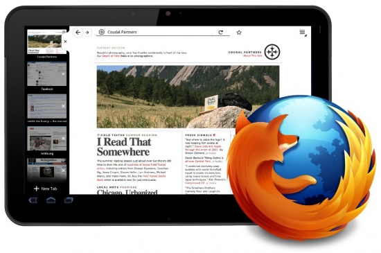
Mozilla provided the first glimpses into their new specially designed Firefox browser for Android 3.0 tablets.
According to sources, the design team behind the new Firefox was aiming to make their tablet browser as simple and minimalist as possible, but without losing all the “signature elements” that people have come to expect from Firefox.
Similarities to the desktop and notebook browser include visual elements such as the shapes of the tabs, the back button, and so forth. Functionality wise, it will retain the same “Awesomebar” for quick tab access, bookmarks, history and the like. The main difference with these features is that the tabs will be located on the left-hand side of the screen instead of the top, so that the user can quickly thumb over to other tabs.
Like with other programs for tablets, the browser will adjust itself depending on which way the user is holding the screen.
In landscape mode the screen is wider, with more space for the tabs on the left side. In portrait mode, the screen in longer, with a top menu that offers drop down tabs.
Portrait mode also gives the user more screen space for the pages they are viewing than landscape, which opts more towards having many pages open at once. Both modes can be flipped to back and forth simply by quickly rotating the tablet.
One of the aspects that the design team wants to make clear is that Firefox for tablets is not the same browser as the one for Android phones. They hid most of the UI elements from the smart phone browsers in order to free up more screen space for tablet users. This way users can enjoy “unrestricted browsing”.
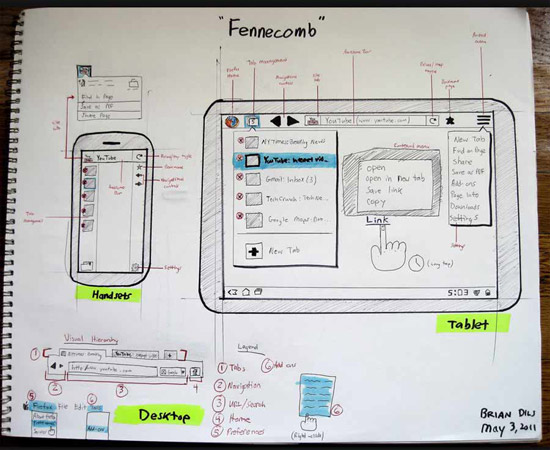
As we can see from their very professional design sketchbook, the team wanted the new tablet browser to incorporate the best elements from both the smart phone and desktop versions of the browser.
In othe technology news, Google announces Gmail, Calendar and Docs that work Offline and Samsung Note Phone-Tablet Hybrid launched in Berlin.


