Movie posters lately have been quite unoriginal, so these five are a breath of very fresh air. With current movie posters often consisting of boring headshots are recurring layouts, it’s great to see some designs that focus more on aesthetic appeal rather than star appeal. Geek-Art has presented us with these brilliant works of art by Ron Guyatt, and while they use the orange and/or blue color palette that also floods current movie posters, I think we can forgive him.
Godzilla
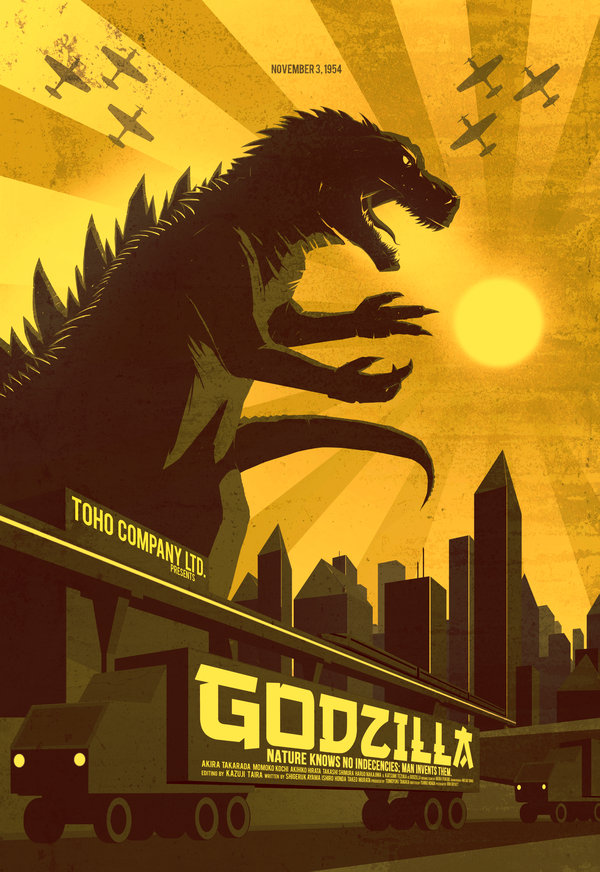
The first takes us back to the original Godzilla movie, with Godzilla filling up much of the frame in all his awesomeness. The sun shines over the skyscrapers of Tokyo, giving off a sunburst effect reminiscent of Japan’s iconic naval flag. Japanese fighter planes fly through the sky while military vehicles drive in the foreground, the side of the trucks plastered with the film’s title and credits.
Portal
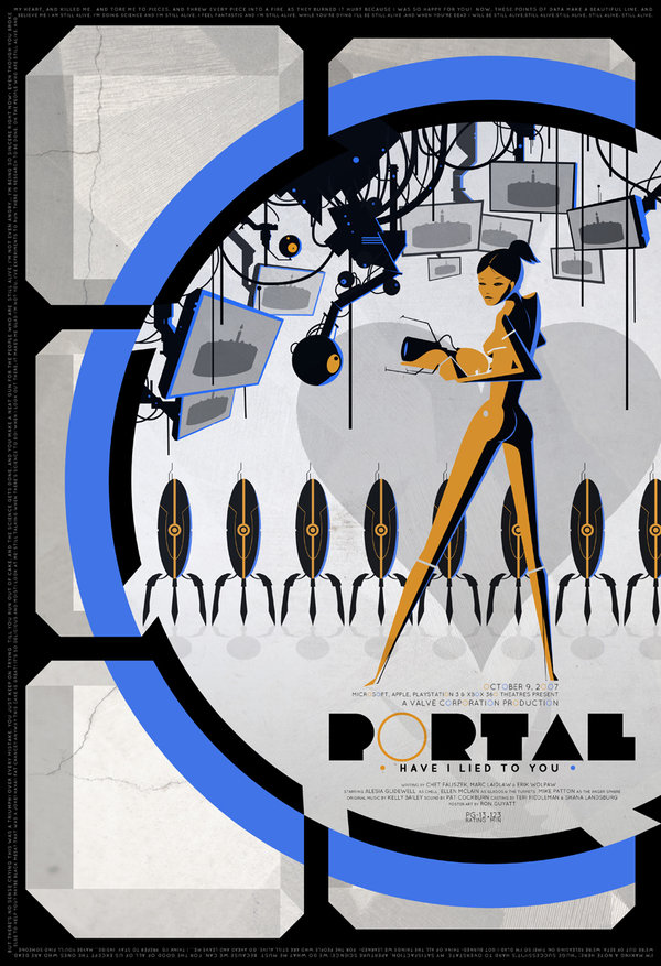
The poster for the popular video game Portal at least has an excuse for the cliched blue and orange color theme given that they’re the colors of the in-game portals. It includes plenty of nice touches from the game, such as Glados’ video screens flashing images of a cake, sentry turrets lined up in the background, and geometric figures reminiscent of the portals and the Aperture Science Weighted Storage Cube. Naturally, the game’s protagonist, Chell, is also featured prominently along with her portal gun.
The 5th Element
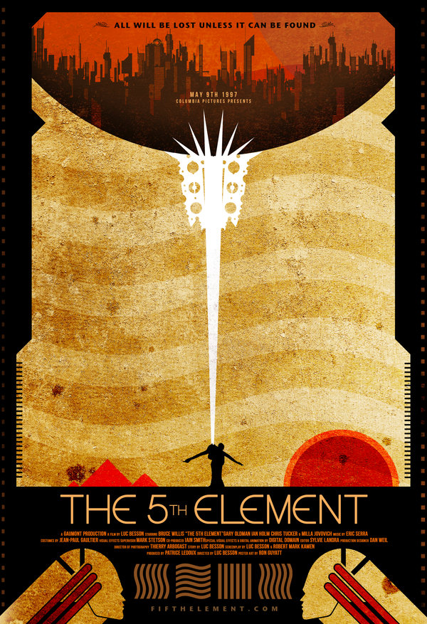
Guyatt’s poster for The 5th Element reminds me quite a bit of the poster for Metropolis for whatever reason, but it absolutely stands on its own. Scenery from the movie is included along with the four element symbols, whereas the fifth (along with the priest’s key) is the central focus. I also like the two heads at the bottom which I assume are supposed to be the Diva Plavalaguna from the opera house scene.
Shaun of the Dead
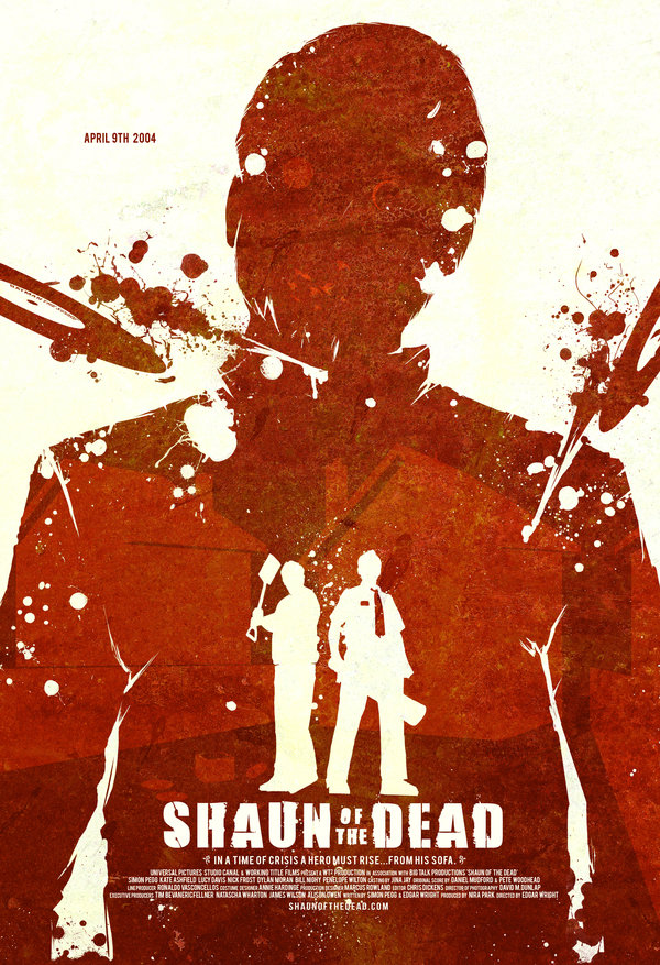
The Shaun of the Dead poster keeps things simple, the two main characters silhouetted in the front while a larger silhouette of a zombie looms behind them. Said zombie is also the recipient of some grisly wounds, inflicted by the vinyl records flung at him in the movie. As you’d expect, the poster has “got red on it.” Lots of it.
Sim City
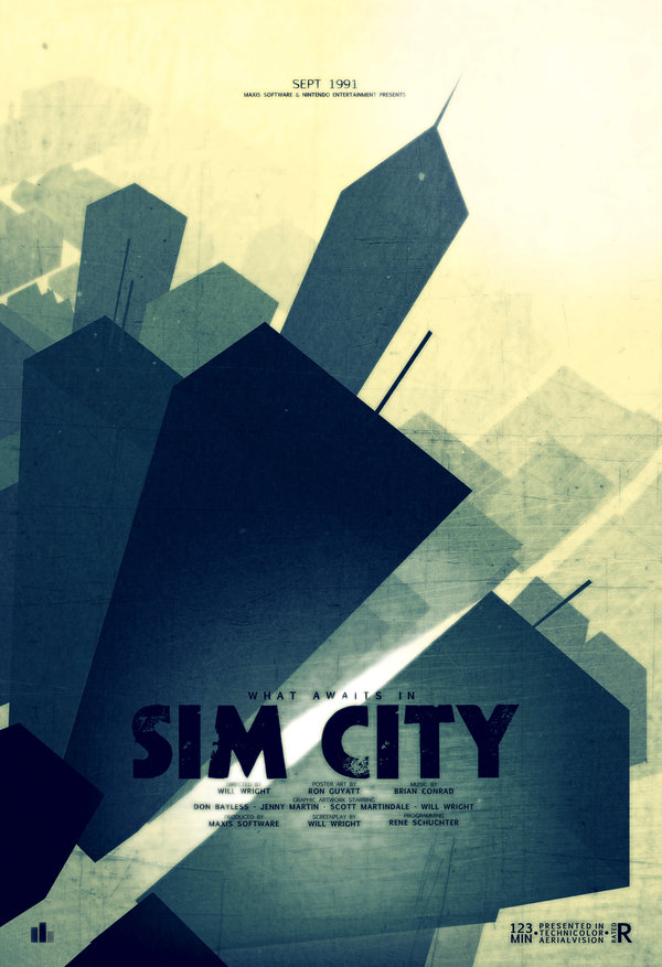
Last, but not least, is a stranger choice for a movie poster, based off the video game Sim City. It’s a pretty poster, but there’s not much to say about it, since it consists mostly of the skyscrapers we all hoped to foster in our own simulated cities. The one neat touch worth pointing out, though, is a small “RCI” chart in the bottom left, the meters in-game which show the city’s need for Residential, Commercial, and Industrial zones. If you enjoyed these fresh new takes on movie posters, do make sure to view our other articles on Pictogram Movie Posters or Six Amazing Star Wars Posters.

