With the Windows 9 tech preview rolling out, we get our first look at Microsoft’s new operating system ahead of its public release.
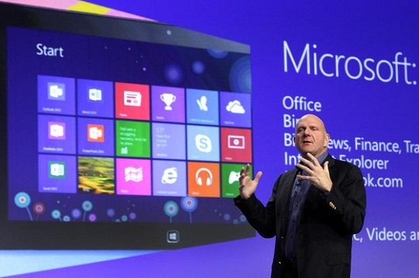
There are many things that you, I and likely many other people dislike about Windows 8. Commonly despised is the ‘Metro’ theme of squares and live tiled widgets that Microsoft included to accommodate disgruntled tablet users and those using laptops and computers with fancy, hi-tech touchscreens. Then, in no particular order, there’s the unnecessary charms bar and its rarely used hotlinks, the removal of the Start button and the fact that Windows became harder to navigate despite ‘navigation’ being the one thing an operating system is meant to be good at. So in short, Windows 8 was a bit of a dud. Windows 9 hopes to improve that though and in a recorded video of the operating system in action it’s guaranteed to give us our most well-liked Windows features back.
The first thing you’ll note in the video above is that yes! Finally! We have our beloved start button once again! Well, sort of. It’s not ‘Start’ as we know it because it’s still labelled with the Windows logo, but its functions appear to be the same as that helpful menu we last saw in Windows 7 (or in a Windows 8 mod if you’re particularly tech savvy). Just like before we’ll get a quick list of programs with easy, pinnable access to many others, but, those pesky live tiles are back. They’re less annoying than before though, which is good and the video above suggests that we’ll be able to add, remove and reposition the live tiles as we see fit to save them from billowing out across our desktop wallpapers like the contents of a trash bag following a hurricane. We know that the charms bar (the list of settings that comes up when you move your cursor down the right side of the screen in Windows 8) has been removed too. Although it wasn’t shown in the video, earlier Windows 9 leaks suggest that it’s hit the scrap heap so that’s fantastic news for the Windows purists and those who felt shafted by Windows 8’s design.
For those who did appreciate Windows 8’s Metro theme though, Microsoft are still catering to you too. Rather than being an uncomfortable juxtaposition of modern, touch-friendly design and the Start menu days of old, you’ll now be able to choose which one your computer uses. If you liked the Metro style then in Windows 9 you’ll be able to enable it in seconds, switching between the two options in no time at all.
It looks like Microsoft are listening then and Windows 9 already looks like a massive improvement – and that’s just apparent from a two and a half minute video. It will be nice to see what else their brand new operating system has up its sleeves and we’ll keep you posted once we know more.
Be social! Follow Walyou on Facebook and Twitter, and read more related stories, Microsoft Prepares to Acquire Majong, Minecraft’s Maker for $2B, Microsoft Vows to Protect Your Data From Government Snooping


