Have you wondered what’s the unhealthiest meal you can buy? What about the healthiest or even what’s deemed healthy for your children? These 5 infographics tell you what’s in your food.
1. 1917 Poster On Food Conservation For War.

Perhaps one of the oldest infographics is this poster issued in 1917 during World War 1.
Food conservation was a must as war was pushing America’s economy to the max and everyday supplies soon became scarce. Food that wasn’t absolutely needed for everyday consumption was often sacrificed and sent to soldiers overseas.
This infographic from the Kansas State Council of Defense stresses the importance of saving bread and rationing food then guilts the viewer about the negative impact of overeating.
2. Who Owns Who In The Soft Drink Industry
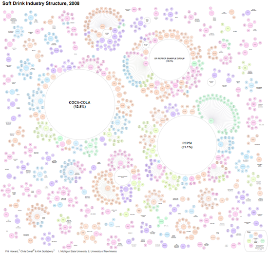
Every where you go soft drinks are always plentiful and never in short supply. They’ve become a staple of American culture but not every brand of cola is as unique as it appears.
This massive infographic — large image link here — from Philip H. Howard shows how three major brands control such a large amount of the cola you drink.
Three firms control 89% of US soft drink sales [1]. This dominance is obscured from us by the appearance of numerous choices on retailer shelves. Steve Hannaford refers to this as “pseudovariety,” or the illusion of diversity, concealing a lack of real choice [2]. To visualize the extent of pseudovariety in this industry we developed a cluster diagram to represent the number of soft drink brands and varieties found in the refrigerator cases of 94 Michigan retailers, along with their ownership and/or licensing connections.
3. Your Lunch Break
![]()
Lunch nutrition for school kids has been the subject of debate between health advocates and the administration that supplies the food.
To highlight the extremities between a “healthy” school meal and a healthy alternative is this infographic that shows what is deemed appropriate for your children to eat. The typical meal consists of processed foods and is made from the USDA’s recommended daily minimum allowances. The processed school lunch isn’t as healthy as you think while the alternative is much healthier for children.
4. The Killer That Is Processed Food
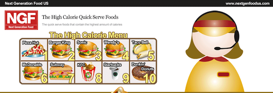
Health is a large issue when it comes to food. The affordability and quick prep times of processed foods make them a convenient but unhealthy option.
However, not many people know or underestimate what’s in processed food which contributes to the notion it’s not that unhealthy to eat. The most easily dismissed factor of processed food is the calorie count — just because it looks doesn’t mean its calorie count is small.
The above infographic highlights the high calorie count of popular processed foods and puts their fat content, cholesterol and sodium in to perspective.
5. Everything You Need To Know About Fast Food
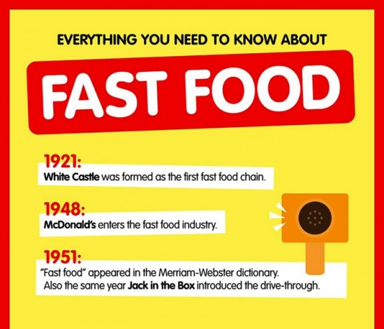
Now that you have a better understanding of what’s in your processed food, why not brush up on your fast food trivia?
This infographic takes a look at the stats that make up fast food sales by country and person. Additional fast food trivia like weird McDonalds menu items, the unhealthiest foods available and average calorie intake per day.


