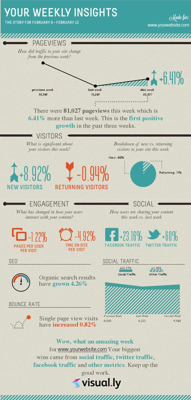
Analytics are an absolutely essential tool for anyone running a blog or website of any kind. Problem is, it can be a full time job just to interpret and convert everything into meaningful information – especially if you need to visualize it for your team.
Step in Visually, data visualization headquarters on the Web. After getting started with cool infographic tools like a resume builder and the Facebook Monsterizer, they’ve introduced today their Google Analytics tool that turns your Analytics data into a concise, easy-to-read visualization.
This way, you’re able to review weekly insights about your blog’s traffic in a snap! Colors change from blue to red, depending on the overall positive or negative results, respectively. They’ll also send it to your email each week, so it’s an innovative way to check out your Analytics data in a snap while on the go.
It’s also a fantastic solution for marketing managers looking to show off the results of a campaign to their team. Oh, and if you need it customized, they offer that option, too, through the Visually Marketplace.
Can’t get enough of infographics? Check out Wearable Tech, Cellphone Radiation Insights and Twitter + Beer = One Rad Infographic Tool.


")


