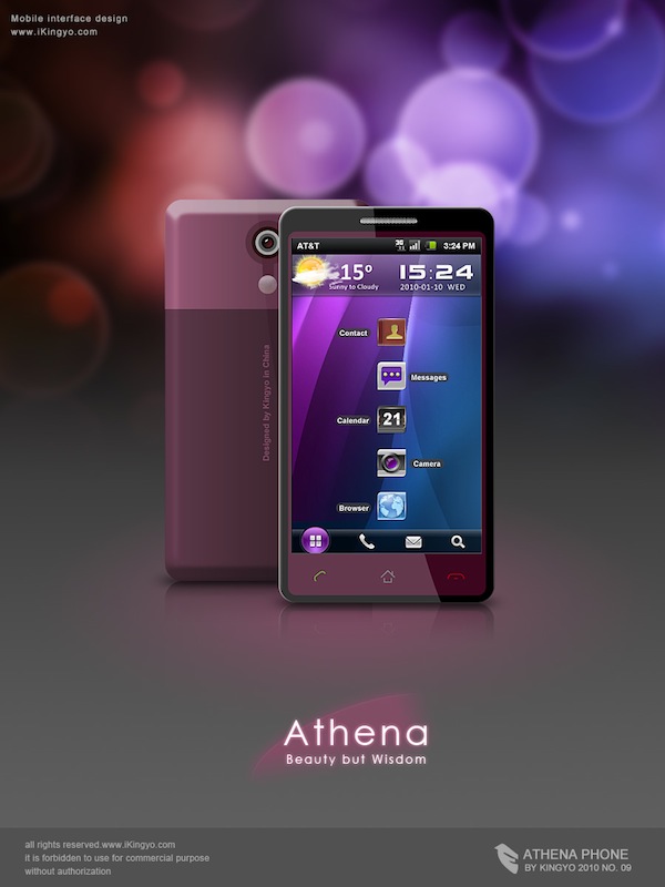
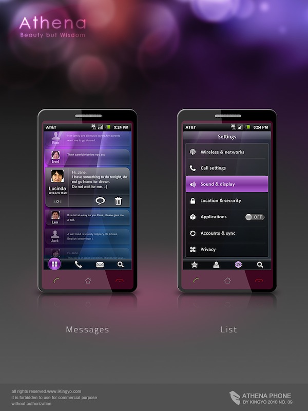
Inspired by Windows Mobile and Android, the Athena concept fuses two qualities into one device.
Chinese designer Kingyo, inspired by the emergence of Android and the new Windows Mobile phones, created his own variant of a smartphone. Targeted towards women, Kingyo focused his effort on the UI design and set it apart from all the other phones by integrating a feminine aspect into his phone.
Kingyo’s physical phone was likely selected from an HTC model using the Android. I won’t be specific, but it does look like quite a mainstream phone from a physical aspect. The touchscreen and buttons at the bottom are the only methods of interacting with the phone.
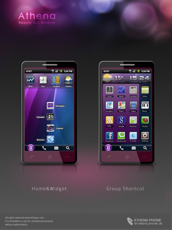
What’s interesting is Kingyo’s choice of including a start button, appropriately placed at the bottom left of the screen. This is in contrast with Microsoft’s choice of putting it up at the top left of the screen, and Android’s use of desktop shortcuts. Kingyo seems to take both options and make use of them. I’m not sure if this would be too well-received, as it does end up looking quite busy. However, without actually interacting with the phone (given its conceptual nature), I suggest you take that with a grain of salt. The theme itself is quite pretty, which I think would suit some women well.
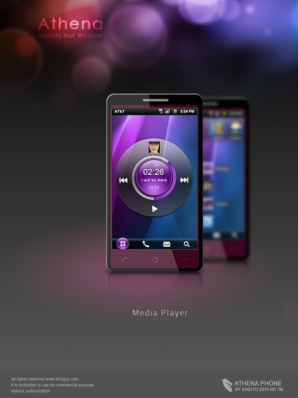
Kingyo chose to also include a mockup of the media player, which in my opinion looks quite a lot better than the other options for Android out there. I’m sure there could be a better way to include the album artwork so it takes up a larger part of the screen, but I won’t complain.
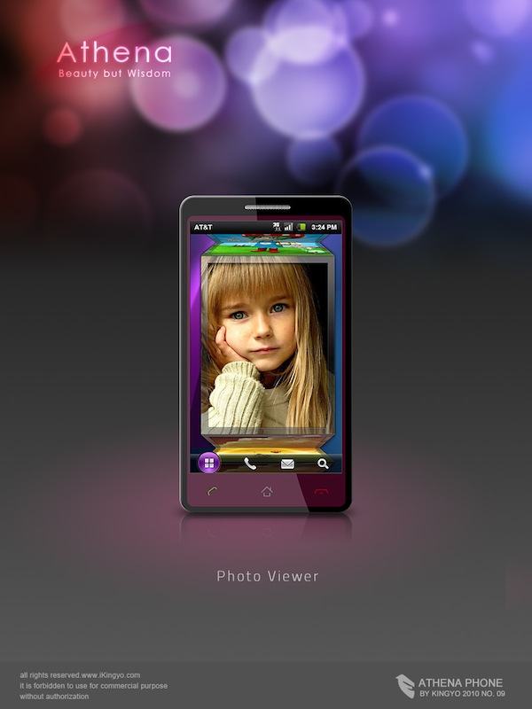
The photoviewer also looks quite unique, I’d assume that it would be possible to swipe and rotate the cube to a different image. It’s quite an interesting take, and definitely more original another lame coverflow knockoff. I like it!
I was a bit surprised by the messages view, as it actually looks decent. I can appreciate the inclusion of contact photos in the actual menu, which is something that I think a lot of phones have these days. It’s a great way to add a little dimension to the text messaging activity.
If you’re into this sort of stuff, the Athena phone concept is actually not a bad interface. It targets a niche market, and although it looks a bit glossy all over, I think that it has a suitable look given its target market. If you’re curious, I decided to put “Beauty and Wisdom” as I thought it sounded less like the two are mutually exclusive. No credit taken from him though, Kingyo’s a Chinese designer and if you asked me to write something in Chinese I’d probably find the task impossible without Google Translate.
If you found the Athena phone interesting, have a look at Kristian Ulrich’s take on the flip phone, the Dell Android smartphone, or the Motorola Atrix smartphone.

