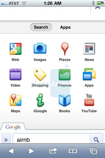
Many iPhone and iPad users are beginning to notice some big changes coming to their Google search page in Safari. Although it has been rumored that Google would bring a mobile dimension to the search page, the new app-like features definitely take search to a new level of convenience.
Phone Arena originally noticed the changes, pointing out that large new icons have replaced the smaller top links. The new icons are visible upon running a search query on an iOS device. The icons include Google searches, images, places, and news.
There are also some additional tabs that can be accessed by pressing the drop-down icon. Interestingly enough though, there is also a separate category for apps that show some of the most common services offered by Google, such as YouTube, Buzz, Google Translate and Maps.
It’s been reported that Google is trying to emulate the look, feel and presentation of the desktop search experience. However, the addition of the tabs suggests otherwise, considering the search page is more optimized for use on a mobile device. It also makes the dedicated Google iOS application less of a must-download, considering that simply bookmarking the new mobile site in Safari is arguably just as convenient.
Although devices on the East coast usually experience updates rather quickly, my device is currently unable to reach the revamped search page. There are also user reports that after browsing the new layout, the page reverts back to the original style; meaning it’s not entirely certain that Google will roll out this new interface.
You can check to see if the redesigned page is available by visiting m.google.com on your iOS device and performing a search (you must be logged in with your Google account on the device).
via 9to5 Mac


