Social networking “discovery engine” StumbleUpon has just launched a major overhaul of their site.
StumbleUpon has always been the unknown giant of social networking, not being talked about in the same sentences as Facebook or Twitter but delivering a lot of traffic to their over 20 million users over the long haul, long after it’s gone viral on other networks. StumbleUpon’s premise is simple: you just fill out what your interests are when you sign up, then download the toolbar to your browser, use the web-based version of the toolbar or mobile apps for iPhone and Android. It’s great for finding websites that you wouldn’t ordinarily discover on your own.

If you hear about them at all, it’s either people raving/complaining about how addictive the service is or the story of how the company successfully bought themselves back from eBay, a sale that didn’t really make much sense in the first place.
StumbleUpon has apparently been building up to a major revamp of the site, with the recent removal of some of the site’s ability to customize their blogs, as well as dumping their forums. Both of these features had been around since the beginning, and quite a few users screamed bloody murder, even if the blogs of those who used the functionality the most often looked like the Second Coming of Geocities.
StumbleUpon announced the new new version in a blog post.
“As the amount of content and information around us grows,” it reads, “discovery is an even more important way to find the good stuff that matters to us. So starting today, we’re rolling out a brand new version of StumbleUpon that makes it easier than ever to discover new and interesting things from across the Web.”
They’ve also made a great video explaining their service:
The first thing users will notice is the logo. It’s orange instead of the classic blue-and-green SU logo of old. It actually looks a bit like the logo for Muni, San Francisco’s public transit agency. Since StumbleUpon happens to be based in the city by the bay, it’s possible that they might have used it for inspiration.
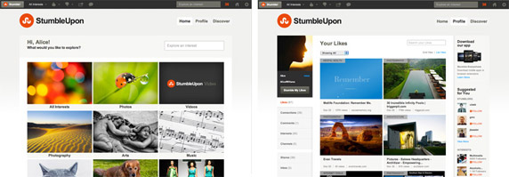
Users who log in will see a menu of icons representing the topics available on SU. They’ve added some very nice icons for their topics. The profile pages have been revamped as well. Users will see suggestions of people and topics they can “follow” in a sidebar. Yes, Twitter terminology has infected other social networks, for better or for worse.

You’ll also see recommendations for “Channels” to follow, such as the History Channel above. SU has also taken advantage of the redesign to launch this new feature to everyone. You can follow sites, people, and brands, including Walyou. Some people might object to the promoted content, but StumbleUpon’s gotta pay the bills somehow!
In addition to stumbling by topic, you can also stumble using the “Explore” button, searching by keywords.
Of course, you can keep stumbling like you have in the past. The web-based “Stumblebar,” which is the new term SU is using, has also been redesigned, and the company hopes to have new versions of their Firefox and mobile apps out soon.
All in all, the site’s design is very slick and streamlined. Of course, there will be the people who don’t like, as inevitably as people complain whenever Facebook redesigns their site. If you’re one of those people, you can go back to the old site design, at least for a while.
The new design is very nice and if you aren’t already a StumbleUpon addict, it’s a perfect excuse to take the service for a spin. You should be warned, however, that you might find yourself wondering where the time went. With the new design, StumbleUpon is definitely not stumbling, but instead is on sure footing.
Don’t miss our coverage of the launch of the StumbleUpon iOS app, as well as list of top 40 StumbleUpon icons, even though they’re based on the old logo.


