Are you a first time web designer and want to start improving your design? The problem may lie in your perception and use of the grid: here’s how to fix it.
Why You Should Use A Grid
Design elements and principles are hammered into every designer as they trudge through school. learning how to create a grid is something you need to learn sooner rather than later. However, some designers just don’t see the point in using a grid when they can loosely align text and elements. Other designers often use a very loose structure that doesn’t unify elements and text in a way that’s meaningful.
Using a grid gives you the opportunity to create elements of consistent width and height which can help establish hierarchy in a website. Legibility is made easier when the eye can scan text that’s properly aligned to a grid. Finally, the grid sets order to design chaos and can solve a lot of problems during the development process.
Designing With A Grid In Mind
Designing a web site with a grid requires a small shift in thought but it’s a shift you’ll need to make.
Before select a pre-made grid or creating your own, you need to understand how the grid works. For web design, you’ll be working mainly with columns that are a certain amount of pixels wide with gutters on either side where no text is meant to go. Some grids have an odd or even amount of columns while others can be divided by odd or even numbers to give you complete flexibility in how columns you’ll have.
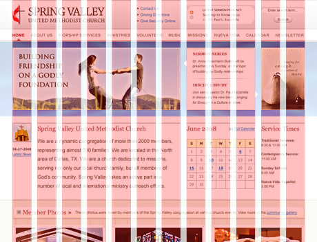
Now to break the grid. While it sounds contradictory, you’ll need to know when to break the grid for it to be effective. For example a 16 column 960px grid will have 16 columns of text if it does not break the grid. That becomes a major problem when you need only a sidebar and major content area.
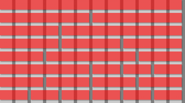
This example of a 16 column grid shows all the possibilities for boxes to break their columns. These boxes, when they break the grid are done in a meaningful way.
Different Grid Types & Resources
There are many different types of grids you can use in your next web site. Here’s a look at some of the most popular.
960px
I use the 960px grid and I love its flexibility. It’s one of the most visually appealing grids for web design and the easiest to use. Free templates are available for almost any design program making it easy to get started with an effective and flexible grid.
Design By Grid
Like with any popular topic or tool, there’s always a thriving community to support it. Design By Grid is a great online resource for those looking to expand their designs using a grid based layout while still thinking out of the box.
Grid-Based Design by Smashing Magazine
Smashing Magazine is a great resource for any designer to reference. Smashing’s article on six creative techniques for grid design expands on this post.


