A great movie poster captures the themes and feelings of a two hour piece of entertainment and boils them down into a single image that can grab the attention of a bleary-eyed passerby and get them interested in the film. Done properly, some movie posters live beyond the movie and become cultural artifacts in and of themselves.
Great movie posters are works of art, fit to be framed and hung on walls. Unfortunately, most movie posters aren’t that great. Instead of going for the iconic, most studios seem satisfied to put together a cheap Photoshop collage, use a fancy font and hope for the best. As long as the title is there in big letters and you can see the star’s face, they could give a damn what the thing looks like.
Inspired by the simple iconic poster, freelance photographer and designer Viktor Hertz has created a series of posters that strip down some classic (and some not so classic) films to their most simplistic. Using pictograph forms, Hertz tells you everything you need to know about the film in stark black and gray. He calls then “Pictogram Movie Posters.” We call them awesome. Here are six he’s recently posted.
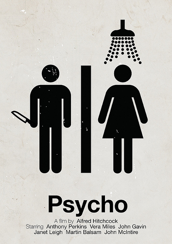
Psycho
Choosing the scene from the classic flick, Hertz has distilled Hitchcock’s thriller into its base components. There’s a girl, a guy, a shower, a knife and it doesn’t end pretty. The distressed effect is a perfect match for the seedy, desperate nature of the film.
Devil
“Devil” was a pretty terrible film, but it might have been a little better if this was the poster. You have to admit, it nails the concept. Five people in an elevator, one of them is the Devil. If only the film was as good.
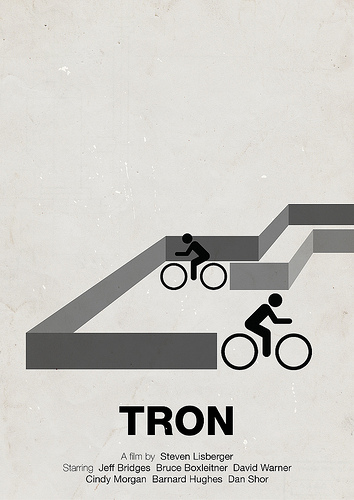
Tron
Based on the original and not the recent remake, Hertz’s “Tron” poster has the clean lines and sharp angles of the movie down right. Plus, it’s probably a lot closer to what a computer of the day was actually capable of.
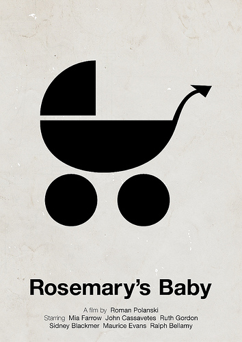
Rosemary’s Baby
Again, simple concept, simple poster. Rosemary has a baby. That baby is the Devil’s seed. It’s a great, subtle image that fits just right with the slow mounting tension of the movie.
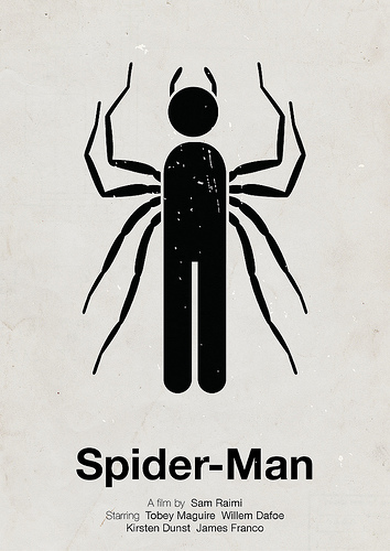
Spiderman
Here Hurtz tackles a more modern film, the smash hit “Spiderman.” But this one may be just a bit too literal.
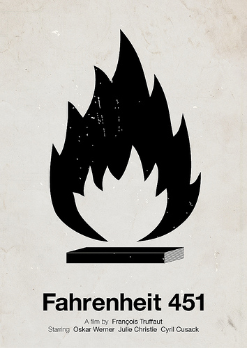
Fahrenheit 451
A poster for Francois Truffaut’s adaptation of the classic Ray Bradbury novel about the dangers of censorship, it’s a perfect image for the dystopian nightmare of a world that outlaws books. It would also look great on the armband of a fascist.
Waterworld
Even Hertz admits he had trouble with this one. Sure, he could have gone with a pictogram guy that was half fish, but then he would run the risk of reminding people how ridiculous the movie was. Better instead to make a world that looks like a drop of water. It’s too bad the producers didn’t use this poster. Then at least one thing about “Waterworld” wouldn’t have sucked.
If you loved these movie posters, check out Lego Inception Character Posters and Post-Modern Star Wars Trilogy Posters.

