After months of preparation, Google finally decided to roll out the new design for Docs and Sites to all of its members, as until now these had been available only to a small number of people.
Google started making changes to the interface in early August. First of all, the documents list have been changed, but soon after that Google proceeded to upgrading the whole collaboration suite. The new design is in the same vein as the other interface changes Google has done recently. This is yet another proof that this company values simplicity and functionality more than complex design that sometimes makes people freeze in front of their computers.
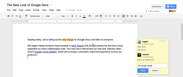
As Vance Vagell, User Interface Software Engineer, claims on the Google Docs blog, “Your content is what’s important, and we aim to highlight it with this new design. You’ll see clean menus and toolbars, prominent action buttons, and colorful presence that pops when you’re editing with others.” In other words, everything you need is in plain sight, fact that will undoubtedly lead to an increased productivity, especially for the companies that use this online office suite. Speaking of the Docs blog, this also has a new look, as Google is experimenting with Dynamic Views, which is the collective name for a new set of Blogger templates.
One of the first recent changes on Google Docs was the prompt saving. More precisely, the document gets saved as soon as a change occurs. As a consequence, users no longer have to be concerned about the integrity of their documents, in the event of an electricity blackout, for example. The Share button has also been changed and it now features an icon, so users can tell at a glance whether a document is shared with anyone or not. This is not the only change concerning the Share button. Some features that were under the Share menu before are now available in the File menu. For example, that is where users have to look if they want to send a document as an attachment.

As seen in the above picture, Google Docs user can choose between three density levels. The only difference between one level and another is the space between the displayed elements. People who do not like the new interface can still use the old one by selecting it from the gear menu. In addition, there is also a link for changing the look in the upper-right side of the screen. Depending on the visual style that is selected, users will see more or less documents on the screen.
Not at last, with this new design, Google also enabled keyboard shortcuts for its office suite. These are also meant to increase the productivity. Since Google Docs and other products of this company will also be available offline in Google Chrome, people will be able to work around the clock, even in remote places.
If you liked this post, please check the offline Google suite and the mobile Google Docs.


