Good evening, fellow archaeologists of the Internet! Welcome to the home page museum, where the past meets up with the present.
Home pages are the first thing you see when you enter a website, and as such, a huge part of the site’s personality. Just like everything else, as long as the site is alive, the page is meant to change, evolve, and mutate. This holds particularly true for the giants that started out in the 90s: the Internet was a different beast back then, and some things weren’t as common in the past as they are now (we’re so glad most sites seem to agree on the white background, nowadays). These are some of the greatest examples of home page evolution, a true blast from the past. This is Internet Prehistory!
Amazon
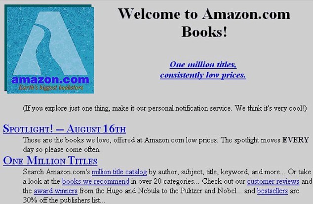
Old Amazon, a giant today, evolved from a book store to pretty much one of the best marketplaces on the Internet. It sells not only books, but a wide selection of videogames, furniture, movies, music, and home appliances. The original site still had the recommendations, one of the best things about the current site but the design didn’t look much different from your standard geocities page, when the “under construction” signs were the norm.
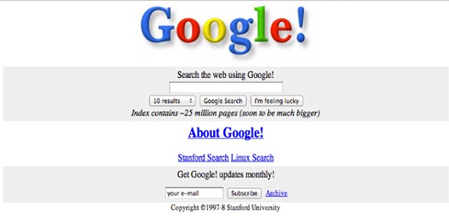
It’s good to see some things don’t change much. Google’s page had way more stuff cluttered in, and since then, they stripped it down to the current version, which paradoxically includes way more services and features than the old one. Google is currently the most used search engine in the world, and one of the staples of the Internet as we know it.
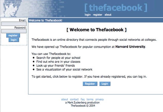
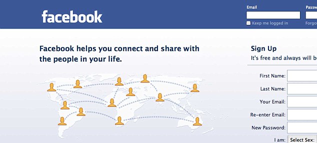
Facebook wasn’t always the social media giant we know today, and had humble origins being only available for Harvard students. Also, notice how the site was called “The Facebook” as opposed to just “Facebook”. A version of the site’s history was told in the movie “The Social Network”, although we may never know just how faithful to reality it is.
YouTube
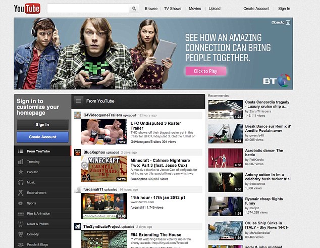
Now here’s a site that we’re not sure if it evolved for the best. The original site was pretty much bare bones, although it had a lot of the options we know today. The greatest triumph of the current design is the “channels” option, which even enables it to somehow compete with regular TV channels. It’s just too bad the site’s cluttered with stuff.
MySpace
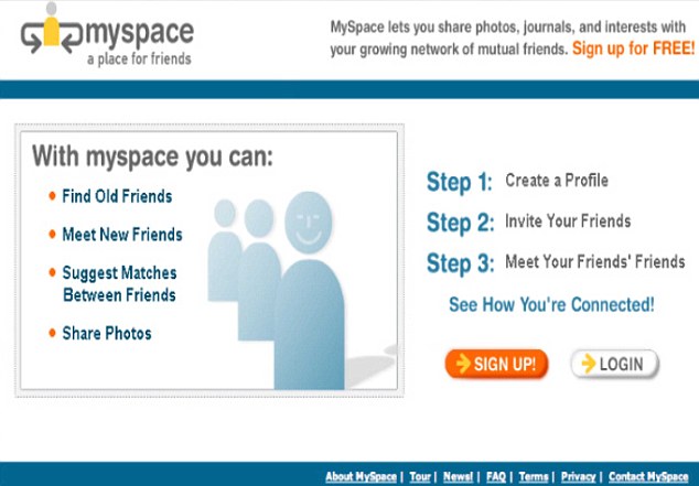
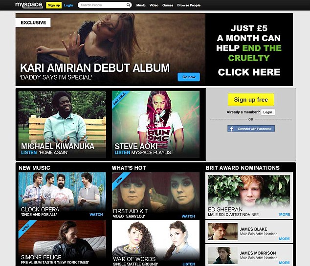
At one point, the “most visited website on the Internet”, MySpace is a has-been of the Internet. Right now it’s mostly used by artists to set up profiles and share their music, as well as some celebrities, actors and actresses, and all that. Still, MySpace is the top social network amongst some minorities in the US.
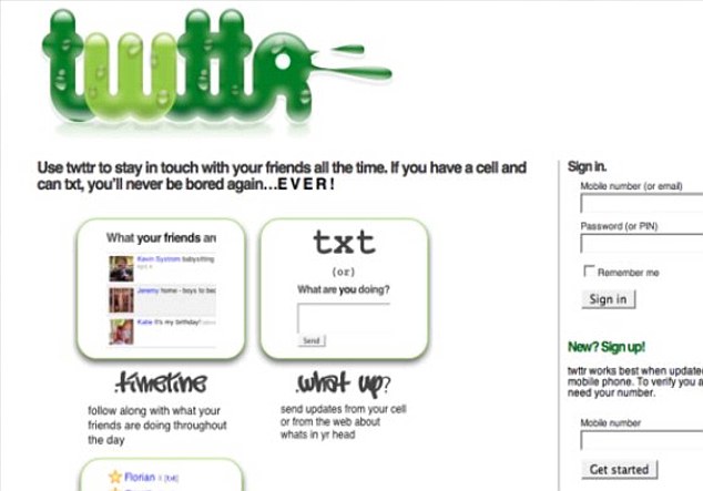
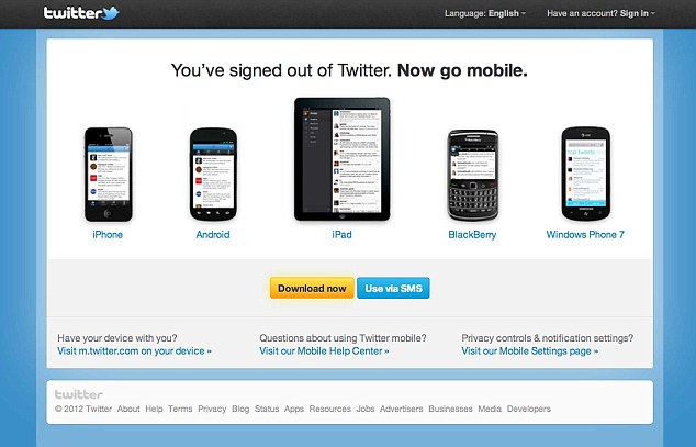
Twitter launched in 2006, with focus on mobile phones. The 140 character limit comes from most phones restrictions at the time, and the concept of the site was based around that. The bizarre logo and green colors are a contrast with today’s black and blue, and bird mascot. The cool thing about Twitter, though, is that most users use the program via apps, smartphones, and what else, instead of actually visiting the website itself. Be honest now, when was the last time you did?
To see more of the past and the future colliding, check out Modern Goes Old School – 16 Bit Video Game Demakes and Blow Off Some Steam With The Steampunk Xbox 360 Controller.

