Minimalism in design is difficult to pull off effectively. To condense a design down to its most basic elements while making it easier for viewers or users to understand can be a challenge. To make creating a minimalist design easier, here’s a collection of minimalism applied to media.
Minimalist Movie Posters
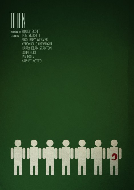
Minimalist movie posters are a personal favorite of mine but some turn out worse than others. How do you begin to condense a 1 and a half to 2 hour story into a poster that needs as little elements as possible? That’s a difficult question to answer but the 50 posters compiled at Forever Geek go beyond the cliche logo with type treatment. Despite not seeing some of the movies on this list, I was still drawn to them by these minimalist posters and have a good understanding of what the movie may be about.
Minimalist Web Design
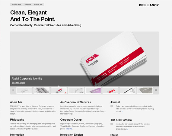
Designing a user interface on a web site with as few elements as possible can be difficult it you don’t know where to start. 1st Web Designer has compiled over 70 sites sporting a minimalist design.
What makes their design work? Hierarchy and typography. Despite being stripped down to their bare elements with most having an achromatic color scheme, viewers instantly recognize only the most important items with the text supporting it.
Minimalist Wallpapers
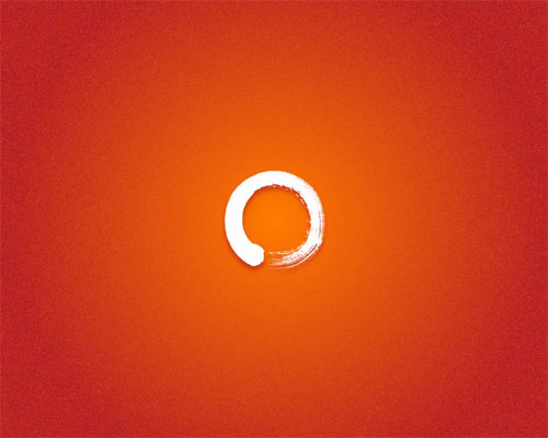
Design inspiration not helping? Sometimes looking at a wallpaper for help or design guidance can help. Grabbing one of these minimalist wallpapers from CreativeFan might help you subconsciously.


