Typography – the are and technique of arranging type in order to make language visible. It used to be a specialized occupation, although nowadays, pretty much anyone can do it.
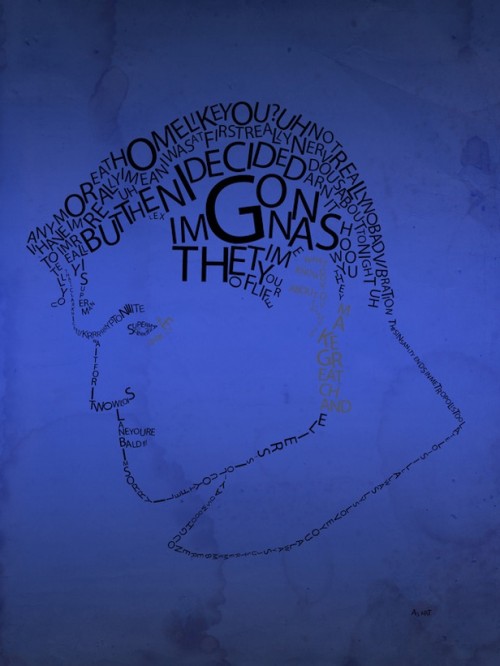
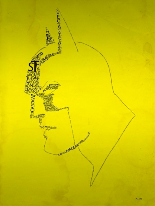
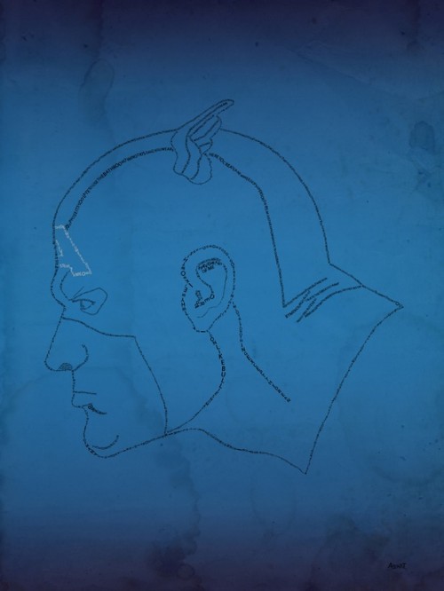
Graphic designer Aurelie Scour was so deeply impressed by the dialogue in certain Superhero movies, he decided to take these words and make a posters out of them, generating the faces of Superman, Batman, Spiderman and Captain America using lines and quotes from their feature films.
Superman Typograhpy
Best line – Lois Lane: Any more at home like you? Clark Kent: Uh, not really, no.
Batman Typograhpy
The best Batman quote comes from the Dark Knight, when the Joker explains how he got his scars. One of the explanations, at least – So I had a wife. She was beautiful, like you. Who tells me I worry too much. Who tells me I ought to smile more. Who gambles and gets in deep with the sharks. One day, they carve her face. And we have no money for surgeries. She can’t take it. I just want to see her smile again. I just want her to know that I don’t care about the scars. So… I stick a razor in my mouth and do this… to myself. And you know what? She can’t stand the sight of me! She leaves. Now I see the funny side. Now I’m always smiling!
Spiderman Typograhpy
Aunt May to Peter Parker – You do too much – college, a job, all this time with me… You’re not Superman, you know.
Captain America Typography
‘Because a strong man, who has known power all his life, will lose respect for that power. But a weak man knows the value of strength. And knows compassion.’

