With the prevalence of cell phones, and especially smart phones, the home telephone has been left in the dust. Still, many people rely on a standard land-line in full or in part. If you’ve gone shopping for a cordless phone lately, you’ve noticed that not much has changed. Most have digital displays with various features, but they still often look clunky and outdated, especially when you try and compare them to something like the slick iPhone.
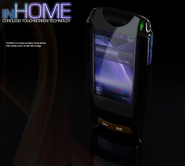
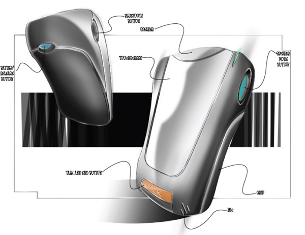
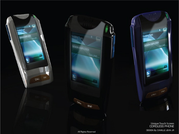
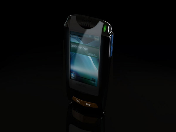
Fortunately, designer Camille Jean has come up with a design on how to update the home telephone, to make it catch up to the feature-rich smart phones everyone knows and loves. In some ways, I think this design even exceeds mobile phones in terms of style. Opting for a slightly tapered design with a couple extra geometric flairs, this phone looks more like an electric razor or something out of Star Trek, and I mean that in a good way. Most noticeable, though, is the fact that this cordless home phone features a touch screen. Now, I doubt that these will end up as application-rich as the iPhone, but touch screens are definitely a way to combine the mobile aesthetic with your home phone. After all, many entertainment center remote controls even feature touch screens now, so why shouldn’t your other handheld consumer electronics?
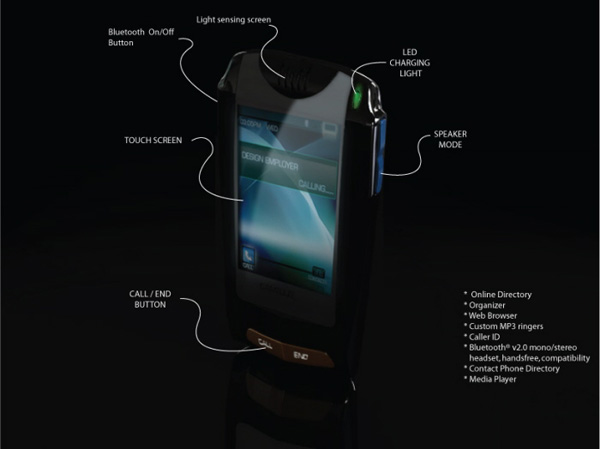
Doing away with the buttons gives the phone a nice-sized screen to take up that frontal real estate, with only “call” and “end” buttons down below, much like on a cell phone. If you browse the specs, you will also see familiar features like speaker mode, a web browser, custom ring tones, media playing capabilities, and Bluetooth compatibility. If phones like this end up actually hitting the market, we might see the cordless home phone make a comeback in popularity. For more trendy phone designs, don’t miss the Athena Concept Phone or the LG Eagle Dual Screen Phone.

