If you ever looked at Pac Man’s design and thought, “It’s so simple, I could have thought of that,” then you might want to avert your gaze.
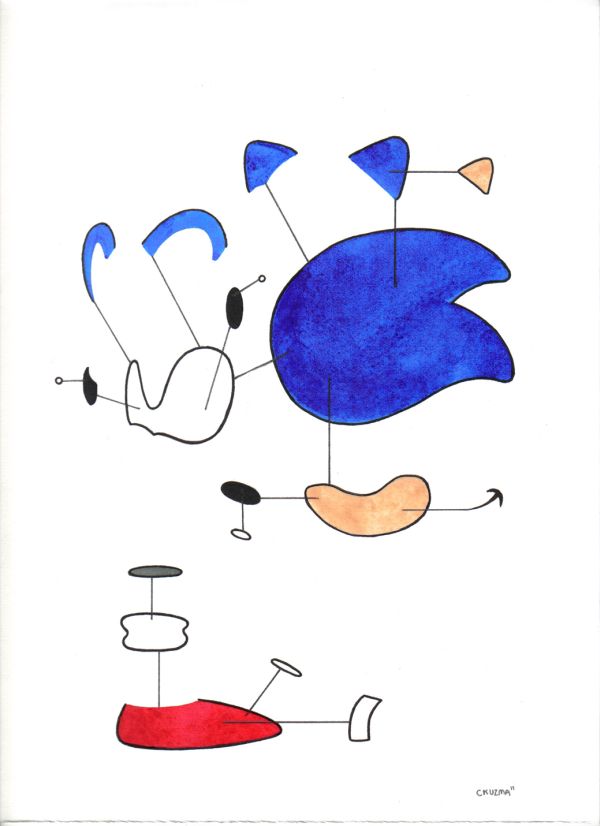
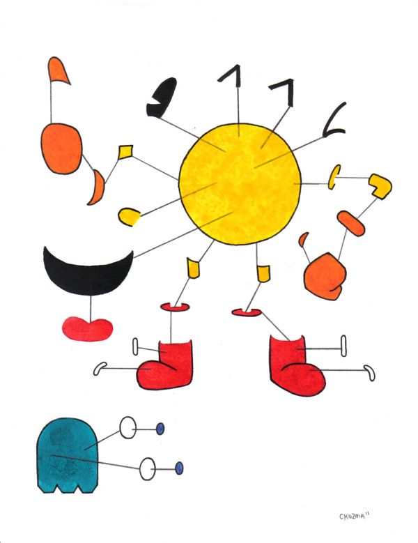
Toronto artist Chris Kuzma recently posted some art on his blog that will only strengthen your suspicions. The pieces include a several iconic video game characters such as Mario and Sonic the Hedgehog, breaking them down into their simplest components.
The illustrations were created for Game Over 4 Show in San Francisco. Chris desribes the show as a “homage to the continuous evolution of video games and their massive influence on popular culture.”
The result looks like a set of Ikea instructions gone terribly wrong. Using Nintendo and Sega’s colourful characters, Kuzma created what’s commonly called an exploded perspective. While the mascots are arguably less enchanting when presented as disparate shapes, I did enjoy the mental exercise of building a Mario in my mind.
I love the idea of taking these characters back to basics. After all, a lot of these guys started out as a small handful of pixels. In fact, we can thank the original NES’s difficulty with complex images for Mario’s iconic mustache. I have to admit, seeing some of my old friends broken down like this was a little traumatic. It’s like peeking behind the Wizard of Oz’s curtain and losing that sense of wonder. Now I feel like given enough trapezoids, hexagons and ovals, I might be able to create the next big video game franchise.
But I guess that’s the point – from the sublime simplicity of Beatles pop ballads like “Yellow Submarine,” to the sleek pontification of Haiku poetry, it really does take an expert to create the simple. After all, wasn’t it Mark Twain who said, “I didn’t have time to write a short letter, so I wrote a long one instead?”
If you’d like to see some more strange video game art, maybe check out these video-game inspired Bento box lunches, or these boss video game tattoos.


