College statistics should be of interest to anyone: debt, tuition, job placement and graduation rate help predict the future of America’s workers. These infographics spell out that future.
Is College Really Worth It?
“Is college worth it for me?” While that question can be argued any way by anyone, even more today with the high price of college and the lack of jobs. This infographic hosted by Fast Company breaks down the average college behavior and the costs of attending a private university over a public a college. The glaring reminder of college debt still existing after graduation is well documented and other facts about student social life such as partying hours and alcohol related injuries are thrown in for good measure.
Educating The Workforce Of The Future
![]()
“What kind of degree is worth it for me?” The quick answer to that is going to be a Bachelors Degree or higher to set you apart from the competition. Good.is, a great source of infographics collaborated with the University of Phoenix to compile the job placement rates and costs of graduating high school and college students. The amount of workers with Bachelors and Associates degrees has been growing steadily since 1973. The infographic also details the highest growing and lowest paying jobs and which typically require a degree or diploma
The Outrageous Hidden Costs Of College
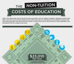
Think college debt is an upfront cost? Think again. College often comes with costs not considered by current students. Coursehero.com created an infographic that breaks down the typical costs of the average college student. Unsurprisingly the high cost of books, materials and transportation ranks high on this infographic. Room and board guzzle down student cash.


