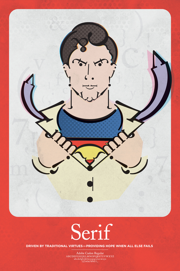
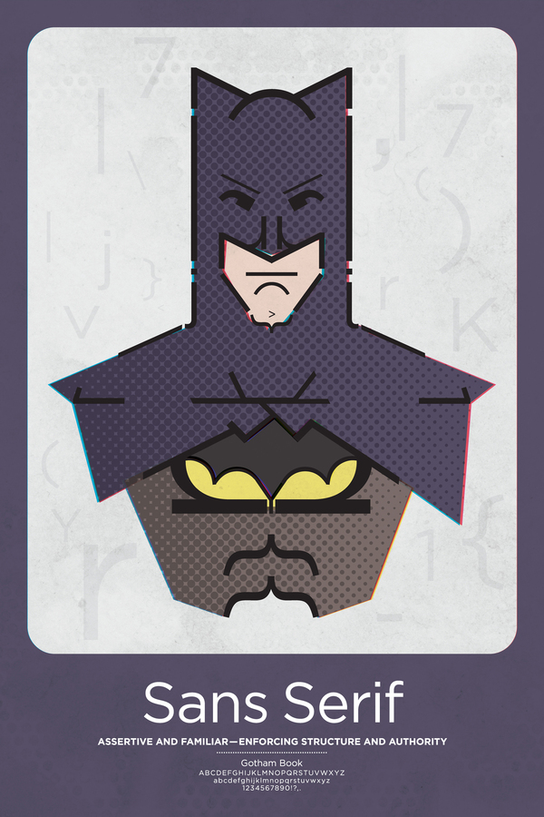
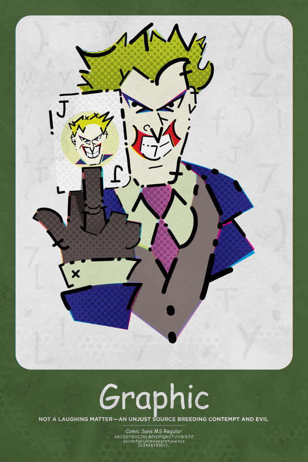
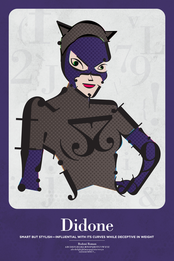
People like to see something of themselves in their favorite comic book characters and especially superheroes. So just like you can tell a lot about a person from their handwriting, you can tell a lot about a Superhero when examining the font that most resembles their personality.
This awesome idea of connecting Superheroes (and the Joker) with typography goes to Matthew Olin, who is responsible for the origins of this awesome gallery.
Superman – Serif
Useless trivia: Serifs originated in the Latin alphabet with inscriptional lettering—words carved into stone in Roman antiquity. The explanation proposed by Father Edward Catich in his 1968 book The Origin of the Serif is now broadly but not universally accepted: the Roman letter outlines were first painted onto stone, and the stone carvers followed the brush marks which flared at stroke ends and corners, creating serifs. Another theory is that serifs were devised to neaten the ends of lines as they were chiseled into stone.
Batman – Sans Serif
Useless trivia: The conventional wisdom holds that serifs help guide the eye along the lines in large blocks of text. Sans-serifs, however, have acquired considerable acceptance for body text in Europe.
Joker – Graphic
Useless trivia: No one knows who the Joker really is, or why he’s like this.
Catwoman – Didone
Useless trivia: Didone is recognized by its Straight (hairline) serifs without brackets; Vertical orientation of weight axes; Strong contrast between thick and thin lines; and an unornamented, “modern” appearance.
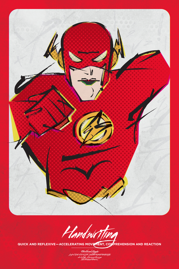
Flash – Handwriting
Useless trivia: There’s nothing really interesting to say about this font.
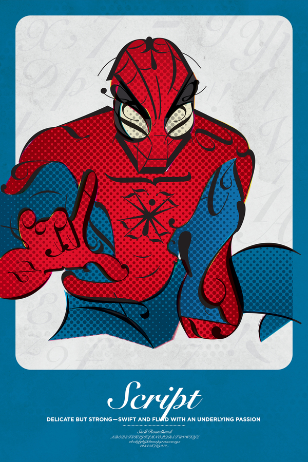
Spider-Man – Script
Useless trivia: A majority of formal scripts are based upon the letterforms of seventeenth and eighteenth century writing-masters like George Bickham, George Shelley and George Snell.
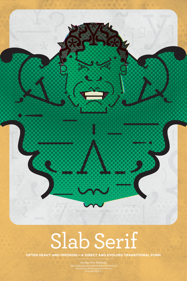
Hulk – Slab Serif
Useless trivia: While there was no relationship between Egyptian writing systems and slab serif types, either shrewd marketing or honest confusion led to slab serifs often being called Egyptians, and many early ones are named for the subject: Cairo, Karnak, and Memphis.
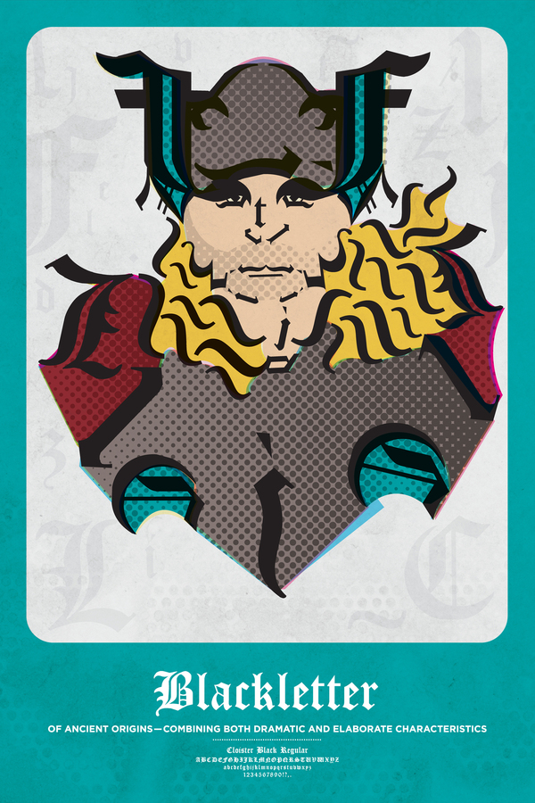
Thor – Blackletter
Useless trivia: It is also known as Gothic script, Gothic minuscule, or Textura.
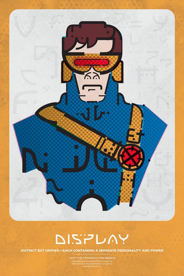
Cyclops – Display
Useless trivia: Modern accounts state that Cyclops’ eyes contain inter-dimensional apertures, releasing powerful energies from another dimension into his own via the beams. These later accounts state that his body naturally metabolizes ambient energy that is used to open and focus the apertures in his eyes. The energy of the beam itself originates from this other dimension. (You need to learn about superheroes as well).
For more on Typograhpy, check out these awesome Superhero Typography works, or check out Typography Designs for the Star Wars Fanatic.

