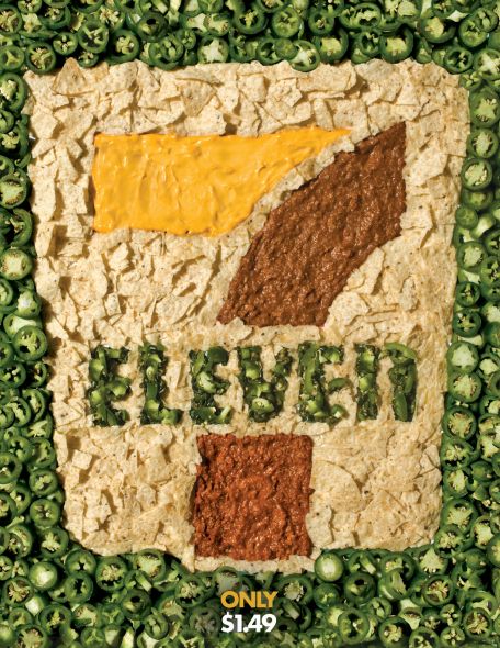
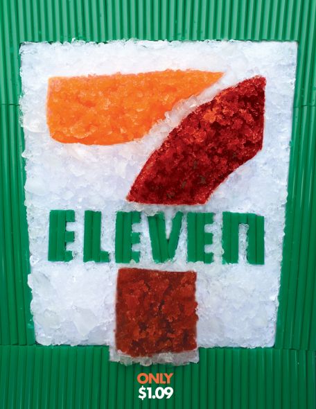
Students at the Miami Ad School San Francisco, USA have uploaded images of their poster campaign for 7-Eleven delicacies.
While they are not very aesthetically pleasing, they sure will make hungry people want to rush to the nearest 7-Eleven to grab a bite. For the nachos, ad copy involves 7 written in mustard ad sauce and eleven written in sliced peppers, arranged in a pattern over a bed of nachos. Not really attractive, but communicated the idea that it has to. It may appeal to people who are so ravenously hungry that they would salivate at any sight of food.
The Big Bite poster shows gingerly arranged sausages and mustard to form the number 7, over a bed of rice. This too, could have shown some buns or maybe they could have thought of a better way to attract hungry 7-Eleven fans.
The prominent Slurpee too has a poster of its own, and is the least weird one of the 3 posters. On a bed of straws, frozen stuff are arranged in a pattern to form 7 and Eleven. Each poster also mentions the price and maybe a great way to lure hungry customers to grab a bite. Nevertheless, Art Director Felipe Mollica and Instructor Peter Durham seem to have targeted an especially geeky crowd which looks for instant gratification than slow arousal patterns.
These posters could be used in schools and dormitories by 7-Eleven to target the audience and get them to eat 7-Eleven food products. However, with all those peppers that are shown in the posters, one could end up with a burning tummy and acidity. If you were looking for ad campaigns that are more exciting, you could take a look at the Super Heroines Posters which aimed to fight crime and breast cancer. The Keep Calm posters are pretty intriguing too, and deserve a look.

